Since 1924, the logo of the brand of paper-based products Kleenex has been growing more and more unique and meaningful.
Meaning and history
Kleenex is an American brand born in 1924 offering dry and wet wipes, toilet paper, paper towels and hygiene products. It is owned by Kimberly-Clark Corporation, which also owns such brands as Huggies, Kotex, Viva, etc.
Today the brand is valued at $3 billion. Products are manufactured in 33 countries and are represented around the world. The company’s headquarters is based in Irving, Texas, USA.
In 2002, Kleenex sponsored the Olympic Games in Salt Lake City. About 10 million USD was spent on the campaign.
What is Kleenex?
Kleenex is a the name of a brand, which belongs to Kimberly-Clark Professional, and was founded in 1924 in the USA. The brand is specialized in the production of such hygienic products as toilet paper, cosmetic wipes, liquid and foam soaps, and disinfectant wipes.
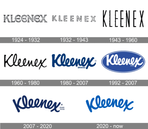
1924 – 1932
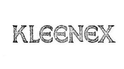
The original Kleenex logo featured a rather unusual and heavy type with unique “E’s.”
1932 – 1943
1943 – 1960
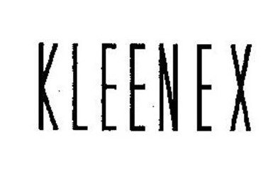
The glyphs grew higher and lighter. They were now solid black.
1960 – 1980
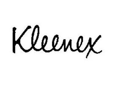
The type was replaced by a custom one. The lettering adopted a carefree handwritten style.
1980 – 2007
The wordmark grew bolder and was now colored dark blue.
1992 – 2007
The lettering grew white, while a blue ellipse appeared behind it.
2007 – 2020
The ellipse was removed from the background, while the lettering grew white again.
2020 – now
The Kleenex logo is a simple, yet effective design. The word “Kleenex” is written in a bold, blue font that is easy to read and recognize. The letters are stacked on top of each other, with the “K” slightly larger than the other letters. This creates a sense of balance and harmony. The blue color is associated with trust, cleanliness, and freshness, which are all important qualities for a tissue brand.
Font and color
The smooth and fancy Kleenex logotype is familiar to people all over the globe. Its soft thick lines and a calming color palette evoke a sense of expertise and professionalism, laced up with tenderness and caress. The Kleenex logotype in a handwritten style is executed in a font which is close to Rockaway Beach Thick Oblique, but with the lines modified.
The combination of white and blue colors in the Kleenex visual identity stands for reliability, safety, and high quality. It also evokes a sense of professionalism and trustworthiness, making the logo look fresh and clean.


