Fa is the name of a popular personal-care brand, which was established in 1954 by the large German Henkel Group. Today the brand distributes its deodorants and shower gels all over the globe, being one of the leaders in the low-price cosmetics segment.
Meaning and history

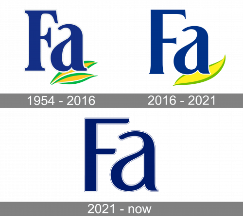
The visual identity of a popular German brand hasn’t changed much since its first logo introduction in 1954. The brand was focused on the production of soaps and lotions with tropical fragrances, and this affected the style and color palette of the logo, which has always been bright and delightful.
The blue, yellow, and green color palette of the brand’s emblem was set in the 1959s, as well as the concept and the composition, which was only slightly refined by now.
1954 — 2016
The original Fa logo, designed in 1954, featured bold blue lettering with the “F” in the uppercase and “A” in the lowercase. The lettering was outlined in white and placed over two delicate yellow leaves with bright green contouring. The leaves were set on the bottom right part of the logo, looking more like an underline, which added some playfulness and style to the overall image.
The lettering was written in a traditional serif typeface, with bold straight lines and smooth yet strong serifs. The “A” was smooth and elegant, resembling a water drop with its right softened part.
The two leaves in intense yellow color were drawn with confidence, and despite their thin and elegant contours looked solid and distinct.
2016 — 2021

The redesign of 1975 kept the original color palette of the Fa logo, slightly lightening it up. The main change was made to the inscription — the letter “F” was completely redrawn, while the “A” kept its unique contouring and softness. The lines of the “F” became wider and stronger, white the massive bold serifs turned into small and sharp ones, looking elegant and stylish.
The two yellow leaves in a green outline were replaced by one, which is now thicker and smoother. The bright green shade of the contour was switched to a lighter, lime-green, making the whole image crispier and fresher.
The bold white outline of the letters is now thinner and more delicate and can only be seen when the logo is placed in a contrasting dark background, which is a rare thing, as almost all Fa products feature white packaging, reflecting the essence and purpose of the brand.
2021 — Today

The 2021 design uses a similar lettering, but nothing else. These letters also have thin white borders, in addition to a slim layer of black further out. The coloring changed to a darker shade, and they also rearranged the font slightly. In particular, they got rid of the serifs in the ‘F’. Now, it’s a perfectly normal sans-serif letter with clipper tips.
Font and color
 The original Fa logo was executed in a custom serif typefaces based on whether Royals Imogen Regular or March Regular fonts, but with the lines modified and the shapes — condensed.
After the redesign, the letter “A” hasn’t changed its style, just the square serif on the end of its line was replaced by a playful and sharp tail. Though the “F” from the brand’s logo today featured a completely different style. The new wordmark is also executed in a custom typeface, which resembles such fonts as Jazmin Semi Bold and Mango Gothic.
The bright blue, yellow, and green color palette of the Fa logo represents freshness, energy, and dynamics, making the brand look reliable and trustworthy, and reflecting its professional and fundamental approach to personal hygiene.


