The company was established by Thomas Lyle Williams in 1915. Back then, he was only 19 years old. The first product was named Lash-Brow-Ine. It was based on the mixture of Vaseline and coal dust, which Thomas’s older sister used to make her eyelashes look more beautiful. Later, Thomas named his brand after his sister Mabel.
Meaning and history
The history of the world-famous cosmetics brand Maybelline goes back to 1913, when brother and sister, Mabel and Thomas Williams from Chicago, invented the first mascara. His mascara first went on sale under the name Lash-Brow-Ine. Two years later Thomas came up with the name Maybelline, so it is 1915 that is considered the official date of the brand’s foundation.
In 1920, the brand’s range expanded: women were offered eye shadows by Maybelline. The year 1930 marked the history of Maybelline with another invention: women were offered eyeliner and eyebrow pencil. In the 1970s, mascara, eye shadows and pencils were joined by other makeup products: foundations, lipsticks, and colored nail polishes. In the 1990s, the brand moves to New York, chai gin its name to Maybelline New York.
What is Maybelline?
Maybelline is the name of one of the world’s most famous make-up cosmetics brands, which was established in 1915 in Chicago, and today has its products distributed all over the globe. The brand is owned by L’Oreal, the global leader in the cosmetics segment.
1920 – 1935
1935 – 1956
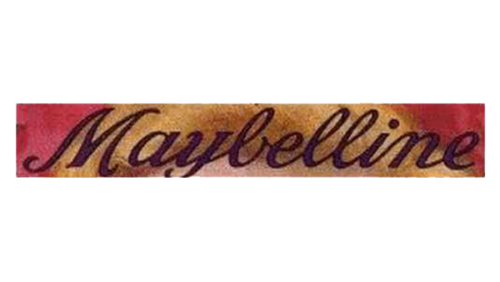
On the advertisements of this period, the Maybelline logo features a type inspired by handwriting. The glyphs are formed by elegant calligraphic strokes.
1956 – 1979
The handwriting-inspired style is preserved, and yet, there are quite a few alterations. On the whole, the wordmark looks lighter than its predecessor, with higher letters. The “M” is larger in comparison with other letters, with its ends forming beautiful curves. The design is slightly more casual than the previous one.
1979 – 1992
When the brand introduced its first range of lip products, an utterly new logo was unveiled. The word “Maybelline” now featured a simpler type. The letters were positioned so close to each other that they stuck together or overlapped.
1992 – 1996
This version appears virtually the same, apart from a couple of barely noticeable alterations (the lower end of the “y,” for instance).
1996 – 2002

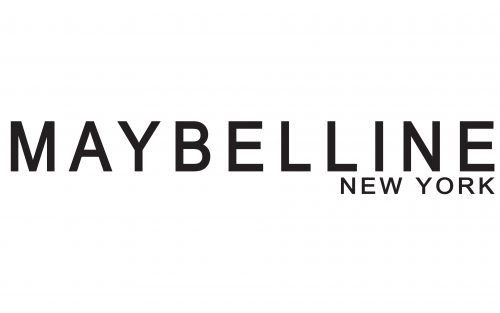
The wordmark is given in an austere sans. The name of the brand looks rather wide. It is partly due to the pretty flat type and partly due to the generous breathing space between the glyphs.
Below the word “Maybelline,” the lettering “New York” can be seen. While the type is the same as the one featured above, the space between the letters is smaller. The size of the glyphs is smaller too.
2002 – 2019

While the basic shape of the glyphs has remained the same as in the previous Maybelline logo, the type has grown somewhat lighter. The lettering “New York” now looks smaller.
2019 – now
Font and color
The bold geometric lettering from the primary Maybelline logo is set in the uppercase of a heavy modern sans-serif typeface with the characters placed on a significant distance from each other. The closest front to the one, used in this insignia, are, probably, Fluro Semi Bold, or M Hei PRC Heavy.
As for the color palette of the Maybelline New York visual identity, it is based in plain and flat black, a timeless choose for fashion and beauty-related companies, which always looks actual and elegant.


