Amway was established in 1959 by Jay Van Andel and Rich Devos. L.O.C. (Liquid Organic Cleaner), which was initially marketed under the name “Frisk,” was the first product sold under this brand.
Meaning and history
Amway Corp is an international manufacturer of mass-market beauty, health, and home care products, which was founded in 1959 by friends and business partners Jay Van Andel and Rich DeVos in Ada, Michigan, USA.
The company’s activities are not limited to the production and sale of goods. Each customer can become an independent entrepreneur at Amway and build their own direct sales business.This meansthe company works on a principle of Multi-Level marketing or MLM.
Today Amway has 15 production facilities around the world and a wide distribution network in more than 100 countries, with almost 20 thousand employees.
Ingredients for the Amway products are grown and processed at the company’s 3 organic farms located in the United States. Amway uses sustainable farming practices to produce biodegradable organic products. The company also conducts its research to produce the highest quality products.
What is Amway?
Amway is an international manufacturer of personal care, household chemicals, cosmetics, dietary supplements, and household items. It was founded in 1959 in the United States. Today the company operates in more than a hundred countries across the globe.
1959
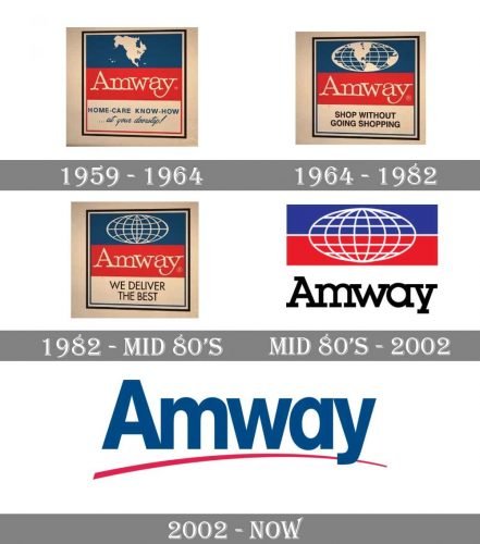
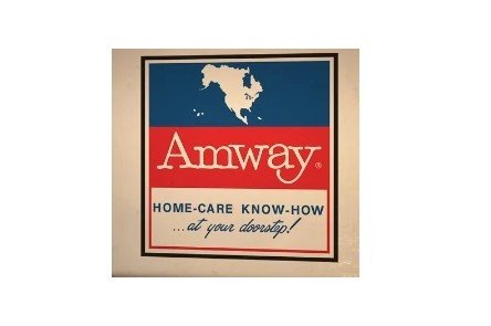
The earliest Amway logo had a pretty casual style. The name of the company looked as though it had been printed using an old typewriter. It was white, while the background was red. Above the red stripe, the blue one was placed. Here, there was the white outline of North America.
Below the red stripe, a white one could be seen. It featured the lettering “Home-care know-how” (capitalized, sans serif type) followed by “… at your doorstep!” (lowercase, handwriting-inspired script). Both the lines were blue.
1964
When in 1962 Amway opened its first international office (it was located in Ontario, Canada), it was the start of a long way to the global presence. The company implemented its global ambitions in the updated logo, which was introduced in 1964.
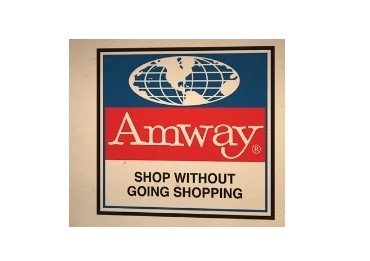
Like the previous one, it resembled a flag with three fields. While the central field featuring the word “Amway” in white over the red background remained the same, the other two were updated.
The blue field on the top now featured not just North America but the globe (although other continents were only partly visible). The white field below showcased the tagline “Shop without going shopping.” The tagline was given in black. The designers opted for a generic sans serif typeface.
1982
The continents disappeared from the globe. It now was just an abstract depiction of the earth with parallels and meridians. The tagline was replaced by “We deliver the best.”
Mid 1980s
The blue and red fields grew shorter, while the white field grew larger. The globe (without the continents) now spread on both the red and the blue fields. The name of the company, which was now given in a type with pronounced serifs, could be seen on the white field. There was no tagline at all, while the logo was placed inside a thick black frame.
A version without the frame was also used.
1997
Everthing that could be found inside the frame remained unchanged. The tagline “The Business Opportunity Company” appeared below the frame.
2002
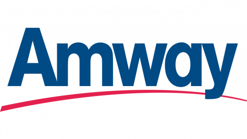
The current Amway logo is by far simpler than its predecessors. The name of the company is given in an unpretentious sans. The initial “A” is the only capitalized glyph. The design would have looked quite generic if not for the red stroke below, which adds a subtle unique touch.
Font and Color
The bold blue title case logotype from the Amway primary badge is set in a traditional heavy sans-serif typeface with massive letters. The closest fonts to the one, used in the Amway insignia are, probably, Europa Grotesk Nr 2 SH ExtraBold and Coolvetica Bold.
As for the color palette of the Amway visual identity, it is based on a combination of blue and red, set against a white background. This is not only a timeless and elegant scheme but also a very patriotic one, executed in the shades of the national flag of America.


