

![]() Avon Logo PNG
Avon Logo PNG
Avon is a British brand of a make-up, skin- and personal care products manufacturer, which was established in 1886. Today the company is in the top5 of the world’s ranking in its segment, operating across the globe through almost 30 thousand employees. Since 2020 the brand is owned by Natura & Co Group, Brazil.
What is the symbol of Avon Products?
The symbol of Avon cosmetics is its logotype, which says much more than any graphical element can. The Avon wordmark features bold and elegant lines and a very interesting and feminine color palette, which is, actually, the main element of the company’s visual identity. The colors in the symbol reflect the brand’s purpose and target audience, showing the passion of the company for what it does and the wide range of products it offers.
Meaning and history
![]()
The history of the famous cosmetic corporation’s visual identity is a perfect graphical representation of progress and innovations. It reflects the company’s development and shows all the milestones of its growth.
All the timeline can be roughly divided into two periods: a CP, or Californian Perfume, emblems, which were used by the company until 1930, and the era of the logotypes, which started in 1930 and still continues.
What is Avon?
Avon is the name of a famous American cosmetics company, which was established in 1886 by David McConell. The company is specialized in the production of cosmetics, limited edition home goods, perfumes and fashion accessories, which are all produced under the same brand name.
1886 — 1904
![]()
Established as California Perfume Company, the brand designed its first logo in 1886. It was a classy ornate emblem, with ribbons above and under it, where the wordmark was placed. The “Trade Mark” lettering was located from both sides of the circular medallion, with a very detailed image of the goddess on it.
It was a traditional and beautiful example of the logo for its time and stayed with the company for almost twenty years.
1904 — 1911
![]()
In 1904 the logo was redesigned in order to get a more modern simplified look. The image of the goddess was replaced by a strict and laconic “CP” monogram, while the ribbons were now flat and monochrome, all the gray gradients were gone. The bold sans-serif inscriptions and simple neat contouring, this is why the logo looked like for the next seven years.
1911 — 1929
![]()
The last logo for the Californian Perfume Company was designed in 1911. It was an oval medallion with a wordmark inside. The wordmark consisted of the “CPC” abbreviation written in an elegant custom typeface with the curved line of the letter “P”, and an arched underline “The Sign of Quality” in all-caps of a simple yet bold sans-serif typeface.
The most interesting part of that logo was its frame. It was a chain, formed by numerous squares, where the company’s name was written. One square per letter. It looked like a fancy necklace, reflecting the essence and purpose of the brand, and making it stand out from the list of its competitors.
1930 — 1936
![]()
The first Avon logotype appeared in 1930. It was a stylish modern inscription in a custom sans-serif typeface with a recognizable smooth arched “A” and a slightly curved right bar of the “N”.
It was a strong and confident logo in a monochrome palette, which was a brilliant accompaniment to every product’s package, it also looked great on all the company’s advertising.
1936 — 1947
![]()
The new visual identity was designed in 1936. Now there was not only a wordmark but also a bold emblem, placed above it. The emblem consisted of a stylized letter “A” placed on a flower with two leaves, spreading to the left and to the right.
The tulip was a representation of femininity and beauty, and the unique typeface had its letters “A” and “O” resembling flowers.
1947 — 1954
![]()
Another logo with and emblem was created in 1947. It was a sophisticated and elegant version, with the stylized flower of the emblem, composed of four petals, formed by curved smooth V-like shapes. The wordmark in all capitals has “N” in the lowercase and was executed in a classic serif typeface with clean and strong lines.
1954 — 1972
![]()
The script logotype was designed in 1954 and stayed with the brand for almost twenty years. It was a diagonally placed cursive inscription, with a beautifully curved capital “A” and delicate lowercase “v”, “o” and “n”.
1972 — 1997
![]()
The logotype of 1970 features a bold inscription in all-caps with “N” in the lowercase. It was written in a custom serif typeface with distinct wide serifs and confident thick lines of the letters. The logo looked powerful and stylish.
A little later the company started using a colorful version, where the white logotype was placed on a bright blue background and had a pink underline.
1997 — 2007
![]()
The blue wordmark with the black tagline — that is how the company’s logo from 1997 looked like. All capital letters of the brand’s name were executed in a simple sans-serif, which is very similar to Futura Family fonts. The letters are slightly extended and have a lot of space between them.
The tagline “The Company for Women” was written in all the lowercase letters in order to give a friendlier and a more welcoming feeling.
2007 — Today
![]()
In 2007 a finer and more delicate logo was designed. The inscription in pink is now written in a thinner sans-serif. The logo is still in use today as the secondary one, along with its bolder version in black. The typeface is pretty close to extended Futura or Geometos font.
2019 — 2020
![]()
In 2019 the company has introduced a new badge — with the extra heavy uppercase lettering in a custom serif font, set in black against a white background. It was a modernized version of the badge from the 1970s, but with refined contours, and bolder lines. Another new thing here has the diagonal placement of the negative space of the letter “O”, which created a unique motion of the stable and strong letters, adding some playfulness to the monumental traditional composition.
2019 — Today
![]()
Another version of the logo, designed for Avon in 2019, is still used by the company. Unlike the previous badge, this uppercase logotype is set in the clean medium-weight sans-serif font, with very minimalistic contours of the black letters, set against a white background.
2020 — 2023
![]()
The new visual identity for the company was created in 2019. It looks similar to the logo from 1970 but a stronger and more luxurious one. The lowercase “N” is back and the inscription is now executed in a bold serif typeface, which looks close to Silk Serif Black. The most recognizable feature of the new logotype is its diagonally placed “O”, which reflects the uniqueness and individuality of the brand.
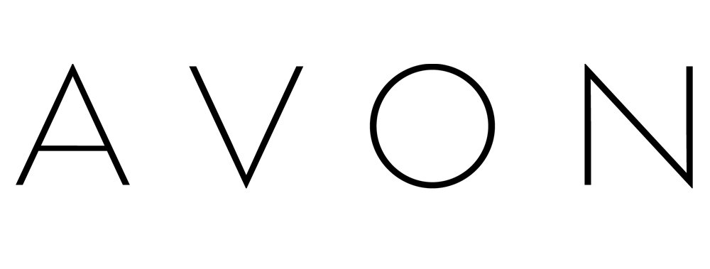
2023 – Today
![]()
The logo in the image is a representation of the brand “Avon,” a company widely recognized for its cosmetics, skincare, and fragrance products. The logo features the brand name in bold, capital letters on a vibrant pink background, which is both eye-catching and symbolic. The color pink is often associated with beauty and femininity, which aligns with the company’s primary market. The use of a stark, clean, sans-serif typeface for the brand name indicates modernity and accessibility, suggesting that the brand is straightforward, trustworthy, and easy to recognize.
The simplicity of the design, with a focus solely on the brand name without any additional imagery or embellishments, underlines the company’s confidence in its reputation and product quality. It suggests that the name “Avon” alone is sufficient to convey its identity and values. This minimalistic approach can be seen as a representation of the brand’s commitment to elegance, clarity, and effectiveness, both in its visual identity and in its product offerings.
Overall, the logo’s design utilizes the power of color and typography to create a lasting impression that is both aesthetically pleasing and symbolically rich. It speaks to a target audience that values beauty, quality, and simplicity, and reflects the brand’s status as a household name in the beauty industry.
Symbol
The Avon logo is highly minimalistic and comprises only two colors: pink and black. Pink symbolizes gentleness, youth, bright mood, and femininity, while black stands for high quality, elegance, and perfection.
Font and Color
The sleek and smooth uppercase lettering from the primary Avon logo is set in a custom designer font, which is based on one of the modern geometric typeface, which is pretty close to Reckless Sans Bold, or Posterama Pro 1927 SemiBold, with some visible modifications of the characters’ contours.
As for the color palette of the Avon visual identity, it looks very tender and feminine with the gradient pink and purple shades, and brilliantly reflects the essence of the company, with women of all ages as the main audience of the brand.


