

![]() A. Lange & Söhne Logo PNG
A. Lange & Söhne Logo PNG
The original A. Lange and Sohne logo had a multitude of intricate details and was rather complicated.
Meaning and history
![]()
A. Lange & Söhne, a distinguished name in the realm of horology, was founded by Ferdinand Adolph Lange in 1845. The company originated in Glashütte, a small town in Saxony, Germany, and rapidly established itself as a pioneer in the watchmaking industry. Under Lange’s visionary leadership, the company introduced several innovations that have had a lasting impact on watchmaking. Notably, they were among the first to incorporate the use of the three-quarter plate in pocket watch movements, a design that enhanced both the stability and the aesthetic appeal of their timepieces.
Throughout its history, A. Lange & Söhne has been recognized for its commitment to precision and craftsmanship. The company played a pivotal role in transforming Glashütte into a hub of fine watchmaking. During the 20th century, despite facing numerous challenges including war and expropriation, the brand continued to persevere and maintain its legacy of excellence. In the 1990s, following German reunification, Walter Lange, the great-grandson of Ferdinand Adolph Lange, played an instrumental role in reviving the brand.
Today, A. Lange & Söhne stands as a symbol of high-end watchmaking, known for its meticulous attention to detail and dedication to creating timepieces of extraordinary complexity and beauty. The company’s current position is marked by a blend of traditional craftsmanship and innovative technology, making it one of the most respected and sought-after brands in the luxury watch industry. Their watches, characterized by their distinctive designs and intricate movements, continue to set benchmarks in the world of haute horlogerie.
What is A. Lange & Söhne?
A. Lange & Söhne is a prestigious German watchmaking company, renowned for its high-end, intricately designed mechanical watches. The brand represents a legacy of meticulous craftsmanship and innovative watchmaking, embodying a blend of tradition and modernity in each timepiece.
1845 – 1948
![]()
To begin with, there was a lot of text. The letters used for the brand name and the word “Glashutte” had “shades” creating a 3D effect. And yet, the two lines didn’t use exactly the same type, the first line had black letters, while the third line featured white letters with black outlines. Also, you could see the words “Uhrenfabrikanten” and “in Sachsen” (in smaller letters). Both of them were drawn in a similar style, although in fact one and the same letter (“a,” for instance) looked different every time it was used. Apparently, the wordmark wasn’t based on a ready-made font but rather was drawn by hand. In addition to this, the original logo contained elaborate curlicues.
There’s every possibility that the only person who adored the intricate emblem was the founder, Ferdinand Adolph Lange, as when he passed the company on to his sons in the late 1870s, the emblem became by far simpler.
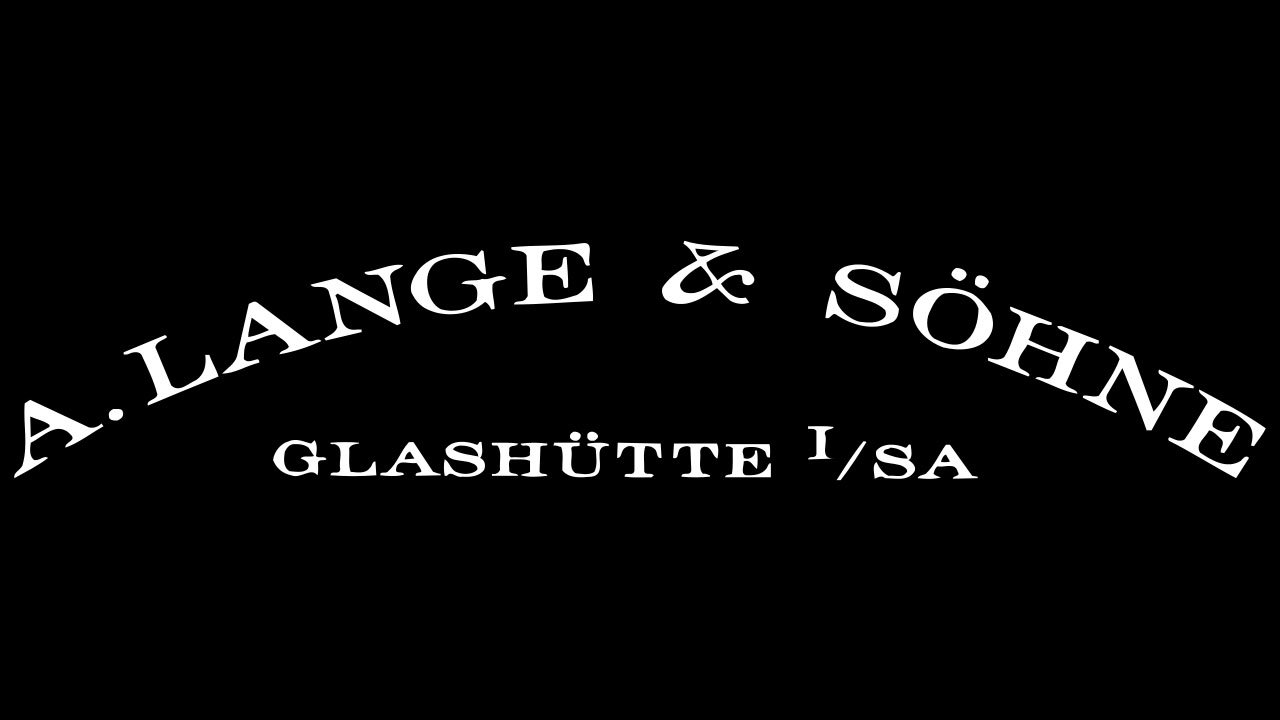
1990 – Today
![]()
This time, the lettering was reduced to two horizontal lines (A. Lange and Sohne” and “Glashutte”).
The brand ceased operation in 1948 but returned back to life in 1990. On the current A. Lange and Sohne logo, the name of the brand forms an arch above the name of the city the company is based in.
Colors
The original combination of black and light grey or gold was replaced by black on the white background in the 1870s.


