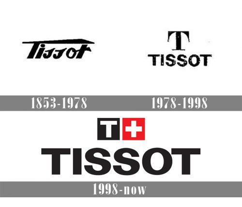
Unlike many of its competitors, the Tissot watches logo has a three-color palette, which is connected with the company’s country of origin.
Meaning and history
Tissot was founded by Charles-Félicien Tissot and his son Charles-Émile Tissot in 1853 in Le Locle, Switzerland. This beginning marked the inception of what would become a globally recognized watchmaking company. Over the years, Tissot has established itself as a pioneer in the field, with numerous significant achievements. In the early 20th century, Tissot merged with Omega, another prominent watchmaker, forming the SSIH group. This move was pivotal in strengthening Tissot’s market presence.
One of Tissot’s main achievements includes its innovation in watchmaking technology. The company was one of the first to mass-produce pocket watches, significantly contributing to the democratization of timekeeping. Later, Tissot gained acclaim for its antimagnetic watches in the 1930s and its T-Touch technology in the early 2000s, which integrated touch-sensitive sapphire crystals in wristwatches. These innovations not only solidified Tissot’s reputation for quality and precision but also showcased its commitment to integrating new technologies in watchmaking.
Today, Tissot remains a significant player in the watchmaking industry. It is part of the Swatch Group, the largest watch producer and distributor in the world. Tissot continues to be known for its high-quality, innovative, and affordable watches. The company maintains a strong global presence, with its products being sold in over 160 countries. Tissot’s current position reflects its long-standing tradition of innovation, quality, and accessibility, making it a respected and influential name in the world of horology.
What is Tissot?
Tissot is a Swiss watchmaking company known for its innovative, high-quality, and affordable timepieces. It has a rich history of pioneering advancements in watchmaking, such as antimagnetic watches and touch-sensitive technology.
1853 – 1978
The history of the brand can be traced as far back as to 1853. It was established by Charles-Félicien Tissot and his son. Today, the number of locations worldwide exceeds 16,000.
The Tissot logo has been changing with the introduction of new models rather than by year. The earliest version is presumably the one featuring a handwriting-style script with a sweeping “T.” Another rather popular version is the logo where a square shape housing a “T” can be seen above the brand name.
1978 – 1998

The Tissot logo, created in 1978, stayed with the brand for twenty years and became a basis for the current iconic insignia the whole world recognizes today. The logo was executed in a monochrome color palette and featured composition of a bold sans-serif inscription with the uppercase letters perfectly balanced, and an emblem, placed above it — the serif letter “T” with the elongated tails of its horizontal bar, pointing down. It was a very elegant yet pretty simple logo, which brilliantly reflected the essence of the label.
1998 – Today
As the brand spread its influence to the international market, the logo with the lettering “Swiss” started to be used. In the current version, the name of the country has been replaced by its symbol, the white cross on the red background.
Font
If you’re looking for a type that resembles the one on the Tissot logo, go for Monotype Grotesque Bold Extended. This is one of rather popular grotesque sans serif typefaces. Its author is the graphic designer Frank Hinman Pierpont.
Colors
While the core of the emblem is given in black and white, the red accent on the cross sign helps to make the overall design more dynamic and eye-catching.


