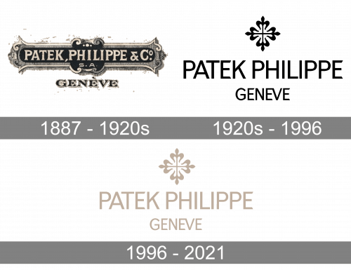
The Patek Philippe logo is a wonderful example of an emblem that can last through centuries. The company has kept it intact for more than 130 years.
Meaning and history

The history of the brand can be traced back to 1839 when Franciszek Czapek and Antoni Patek founded a company named Patek, Czapek & Cie in Geneva. The company specialized in pocket watches. As soon as in five years, however, the partnership ceased to exist, but Patek went on working in the watch business and founded his own company in 1951. Today, the brand bearing his name manufactures 40,000 watches annually.
What is Patek Philippe?
Patek Philippe is the name of a luxury Swiss watchmaking company, which was established in the middle of the 19th century, and today has its watches distributed all over the globe. The brand is known for innovative technologies and the elegant design of the watches.
1887 – 1920s
During the first 15 years of its existence, the watch brand Patek Philippe used a slightly different emblem – it wasn’t as big as the current one, and also had more decorative elements. The original emblem featured the lettering “P. P. & Co,” below which an elaborate curlicue could be seen.
1920s – 1996
The Patek Philippe logo comprises the so-called Calatrava Cross paired with the wordmark.
The Calatrava Cross has a long history. It was a very important symbol among Spanish and Portuguese Iberian orders of Knighthood. The cross received its name in honor of the 12th-century Military Order of Calatrava.
1996 – 2021

The logo didn’t change the logo, except for the color. In 1996, they gave it a blend of grey and beige, which is sometimes called the ‘white gold’ color.
Font
The grotesque sans serif font called Monotype Grotesque Regular looks very much like the one featured on the emblem.
Colors
While originally the logo was given in black over the white background, later the cross turned gold. The color was tweaked several times before it reached its current muted gold shade. The wordmark eventually became brown to fit the gold cross.


