 Ontario Hockey League Logo PNG
The Ontario Hockey League (OHL), a key player in the world of junior ice hockey, operates under the umbrella of the Canadian Hockey League. The league is not owned by a single individual; rather, it consists of member teams that are independently owned. The OHL, known for its significant contribution to developing young talent for the National Hockey League (NHL), primarily operates in Ontario, Canada, but also extends into the United States, with teams in Michigan and Pennsylvania. This league serves as a crucial stepping stone for athletes aspiring to reach the NHL, showcasing a blend of competitive spirit and skill development.
Meaning and history
Founded in 1980, the Ontario Hockey League was formed from the amalgamation of the Ontario Major Junior Hockey League and the original Ontario Hockey Association. This merger created a new powerhouse in junior ice hockey, dedicated to nurturing young talent. Throughout its history, the OHL has been a fertile ground for producing NHL stars, with notable alumni like Wayne Gretzky, Bobby Orr, and Connor McDavid. The league’s achievements include not only developing future professional players but also maintaining a high standard of competitive play and sportsmanship. Currently, the OHL stands as a prominent entity in junior ice hockey, recognized for its significant role in player development, community engagement, and its contribution to the sport at both national and international levels.
What is Ontario Hockey League (OHL)?
The Ontario Hockey League is a major junior ice hockey league, recognized as a pivotal part of the Canadian Hockey League. It’s not just a sports league; it’s a breeding ground for young talent aiming for the NHL. With teams spread across Ontario and parts of the United States, the OHL is a cornerstone in the development of young athletes, shaping the future of ice hockey.
1949 — 1974
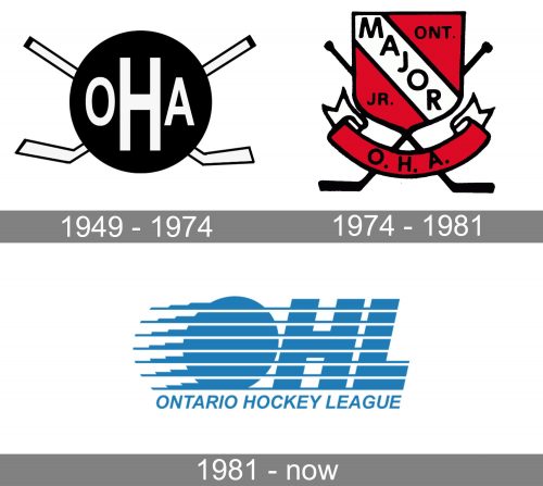
 We should point out, though, that an organization known by the same name existed earlier, too, and had logos of its own. For instance, you can find a black-and-white OHL logo from 1949. It featured the lettering “OHA” over a black circle with two crisscrossed hockey sticks on the background.
1974 — 1981
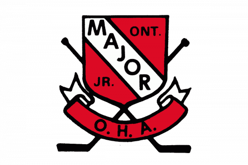 The emblem introduced in 1974 featured the old name of the organization and, therefore, comprised the words “Major” and “Junior.” This version of the logo had a shield shape and also featured two crisscrossed hockey sticks on the background. In addition to black and white, the palette included bright red.
1981 — Today
The 1981 Ontario Hockey League logo seems to be dominated by two concepts: “speed” and “water.” Both of them give a symbolic clue to the essence of the league.
The idea of motion, which is reflected in the horizontal strokes, helps to recreate the dynamic and intense atmosphere of a hockey game. In fact, the large letters “OHL” appear to be moving at a high speed. The “water” concept also seems quite natural for an organization located in Ontario, Canada, which borders with so many large natural water bodies, from Hudson Bay to the Great Lakes. This emblem was adopted in 1981 when the current history of the Ontario Hockey League started.


