

![]() Malibu Logo PNG
Malibu Logo PNG
Malibu is a brand of a coconut flavored liqueur, which has been produced on the island of Barbados since 1893. Malibu is one of the worlds most iconic brand and a number one coconut-flavored rum in the world. It’s been a part of Pernod Ricard Group since 2005, after the French beverage giant acquired Allied Domecq (who owned Malibu) for $14 billion.
Meaning and history
![]()
Today Malibu is an essential ingredient in some of the world’s most popular cocktails.Malibu is produced on the island of Barbados, at the oldest West Indian Rum Distillery in Black Rock, where first-class light rum is blended according to ancient recipes with locally produced natural coconut extract.
The famous beverage first appeared on the market in the 1980s and was originally produced in Curacao. The brand quickly became so famous and profitable that it attracted the attention of the world’s largest corporations, and in 1997 it was bought by the world’s second-largest British concern Diageo, selling the Malibu trademark five years later to international company Allied Domecq for 850 million dollars. Later, in 2005, the brand was bought by the largest French group of companies Pernod Ricard.
What is Malibu?
Malibu is a popular brand, owned by Pernod Ricard since 2005. The coconut-flavored liquor was first introduced at the end of the 19th century, and by today has grown into an iconic brand, known all over the globe.
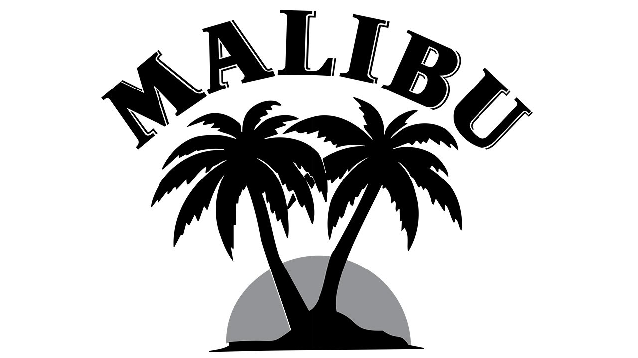
1982 – 2013
![]()
Their original logo consisted of an emblem – a red semicircle posing as the Sun, with two dark brown palms in front of it – capped by a curved writing. The letters there were bold serif characters of the same color.
2013 – 2019
![]()
The 2013 design is much like what they used afterwards, except the wordmark is carried on from the 1982 logo, and the emblem is different. It’s a lot more orange, and there’s an additional uneven frame around the Sun.
2019 – Today
![]()
Malibu Rum is an innovative and dynamic brand that invites consumers around the world to share the Caribbean spirit.
The Malibu logo color scheme is inspired by Caribbean sunset and includes different tones of orange, as well as the coconut main color – white for the bottle, and deep brown for the wordmark and the palm trees.
The famous Malibu logo is an image of two palms and sunset with an eyebrow lettering above it. After the last redesign, the Malibu logo has a new bigger and bolder look with lifted palm leaves, sunset colors and a revised horizon.
The icon is beautifully crafted and looks like a jewel and is aimed to protect the free and easy spirit of Malibu. It captures the inspiring moment when the setting sun meets the beach, and the day opens up into an even better time.
The custom typeface is bold and elegant, based on a classic flare serif font, the closest might be Fire Ladder (with generated shadow lines) or Dragon Serial Heavy.
The Malibu logo is distinctive and modern and emphasizes the unique MALIBU character.
The Malibu brand aims to stay relevant and top of mind amongst a future generation of consumers. The latest redesign made the brand look and feel more contemporary and improved its visibility in e-commerce. The ambition was to create an identity that is as clear and direct as the Malibu brand.
The Malibu logo design is vibrant and fresh, it celebrates the brands spirit. Malibu is all about spreading the summer feeling of being carefree and open to good times.
The most popular advertising campaign of Malibu labeled it as “seriously easy going”, with reference to people from the Caribbean. This “island” focus of Malibu stands in some contrast to the fact that it’s named after the town in California.
Through the evolution of its much-loved design and logo, Malibu is seeking to maintain strong brand equity and relevance with millennials, aiming to reinforce its quest to become a global icon of summer.
Font and Color
The heavy yet very elegant uppercase lettering from the official Malibu logo is set in a custom typeface with the characters executed in bold lines with small playful triangular serifs on their ends. The closest fonts to the one, used in this insignia, are, probably, GHEA Zartonk Extra Bold, or TT Nooks Script Bold, but with minor modifications.
As for the color palette of the Malibu visual identity, it is based on a combination of brown, red, and yellow, very warm shades, representing the island of sunset and evoking a sense of love and romance, making you want to take a day off and enjoy the life around.


