 Oklahoma City Thunder Logo PNG
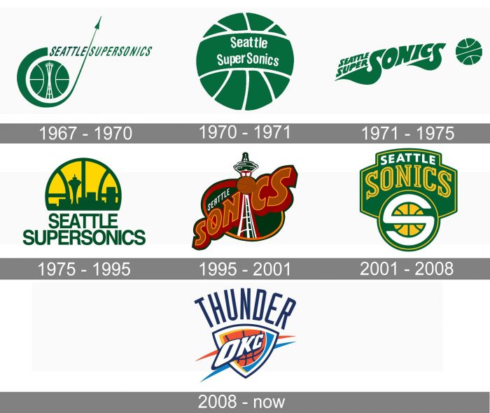
The basketball team Oklahoma City Thunder has existed under its current name for about a decade, and it has had only one logo so far. The club didn’t borrow any elements from the logo of its predecessor, the Seattle SuperSonics.
Meaning and history
The Oklahoma City Thunder, which was founded under the name of the Seattle SuperSonics, joined the NBA for the 1967/68 season. Back then, the team’s logo was based on a green basketball with a space needle inside. A Sonic shuttle could also be seen – it was flying up.
What is Oklahoma City Thunder?
Oklahoma City Thunder is the name of a professional basketball club from the United States, which was founded in 1967. The initial name of the team was the Seattle SuperSonics, which was only changed for the current one in 2008. The club is based in Paycom Center, Oklahoma City.
1967 — 1970
The initial emblem for the Oklahoma City Thunder club was designed in 1967 when the team’s name was Seattle SuperSonics. It was a cool and modern badge in a green and white color palette, with the green basketball having a stylized green orbit around it. The orbit was aiming up and finishing with a rocket. The lettering in a thin italicized Sans-serif was set on the right from the ball.
1970 — 1971
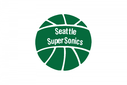
The redesign of 1970 kept only the green ball and placed a white wordmark on it. It was a very simple badge, yet still memorable due to the use of an intense color palette.
1971 — 1975
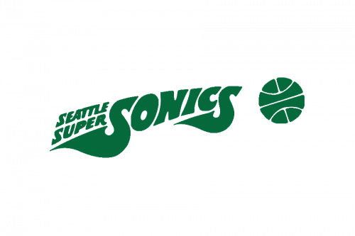 In 1971, the shuttle and space needle disappeared from the Oklahoma City Thunder logo leaving only the green basketball with the old name of the team written across it. The next year, a huge wordmark appeared to the right of the basketball, which, in its turn, diminished substantially.
1975 — 1995
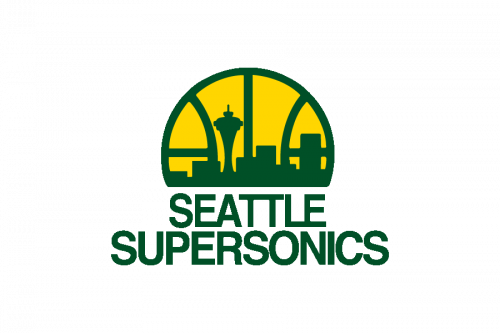
In 1975 the badge changed its concept and gained a new color into its palette — yellow. Now the weird mark was set in two levels under the yellow and green basketball with its bottom part cut horizontally. The yellow background and green stitches of the ball were accompanied by a green landscape of Seattle.
1995 — 2001
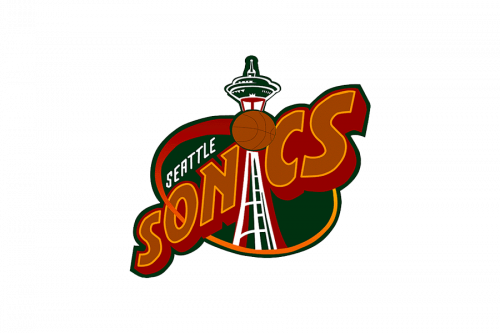
The color palette of the emblem was switched to green and brown in 1995. This time the lettering was a star of the emblem, placed diagonally and executed in a bold thick Sans-serif typeface. The “Seattle” part of the inscription was written in delicate white letters over the green background.
2001 — 2008
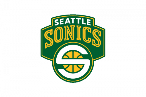
In 2001 the visual identity of Seattle Sonics was changed to a more traditional badge. A green crest had a yellow basketball placed on its bottom part and a white and yellow inscription above it.
2008 — Today
Having relocated to Oklahoma City, the team adopted the name “Thunder,” which was chosen for two reasons. First, Oklahoma City is located in Tornado Alley. Second, it’s the home of the Thunderbirds division of the US Army.
The new team’s logo was introduced on September 3, 2008. Neither the old name of the team, nor its logo or colors could be used in it as they were left in Seattle for a possible future basketball franchise. The club’s majority owner Clay Bennett mentioned that the Oklahoma City Thunder logo design borrowed elements of local sports teams, including two university teams.
Based on a shield shape, the Oklahoma City Thunder new logo features the letters “OKC” over a part of a basketball and the word “Thunder” above.
Font
The word “Thunder” on the Oklahoma City Thunder logo is given in the team’s official font, Industria Bold. It’s a display sans serif typeface created by Neville Brody and published by the Linotype font foundry.
Colors
The colors of the official palette have the following names and values: Thunder Blue (PMS 285), Sunset (PMS Warm Red C), yellow (PMS 1235), and Thunder Navy (PMS 282).
THUNDER BLUE
PANTONE: PMS 285 C
HEX COLOR: #007AC1;
RGB: (0, 125, 195)
CMYK: (89, 43, 0, 0)
SUNSET
PANTONE: PMS WARM RED C
HEX COLOR: #EF3B24;
RGB: (239, 59, 36)
CMYK: (0, 92, 100, 0)
BLUE
PANTONE: PMS 282 C
HEX COLOR: #002D62;
RGB: (0, 45, 98)
CMYK: (100, 68, 54, 0)
YELLOW
PANTONE: PMS 1235 C
HEX COLOR: #FDBB30;
RGB: (253, 187, 48)
CMYK: (0, 29, 91, 0)


