Campbell Fighting Camels Logo PNG
Campbell Fighting Camels is the name of an athletic program of the Campbell University, a private educational institution in North Carolina, which was established in 1887. The program is composed of 19 teams, with men’s clubs competing in nine sports disciplines, and women’s — in ten.
Meaning and history
Campbell Fighting Camels is the common name for all men’s teams of the athletic program of Campbell a university, while the women’s teams are called Campbell Lady Camels. The whole program is composed of 9 men’s teams, and 10 women’s, which is not very common for the NCAA participants.
Apart from being a member of Division I of the NCAA, Campbell Fighting Camels is also a part of the Big South Conference, and its swimming and diving subdivisions compete within the Coastal Collegiate Sports Association. The Campbell Fighting Camels wrestling club is a member of the Wrestling Southern Conference.
What is Campbell Fighting Camels?
Campbell Fighting Camels is the name of the athletic clubs of Campbell University. The men’s and women’s sports teams compete in the first division of the NCAA in various sports disciplines, including Basketball, Baseball, Football, and Tennis.
As for the visual identity, the athletic program of Campbell University has always been loyal to the original color palette and the mascot of the program — the camel. The club’s logo has undergone two major redesigns, but the orange and black combination, with the image of the animal, has always been the most important part of each badge.
1993 — 2004
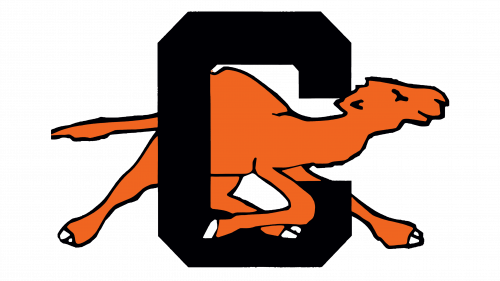
The original Campbell Fighting Camels logo was introduced in 1993, and featured a bold black letter “C” in a geometric sans-serif, with an angular contour, a very common choice for Collegiate logos. The letter was accompanied by an image of an orange camel, running behind it to the right. It was a bright and contrasting emblem, which looked good on the jerseys of the players, and made the club stand out in the list of its competitors.
2005 — 2007
The redesign of 2005 made the Campbell Fighting Camels logo more modern and cool. Now the “C” featured a founded shape, with the serifs, smoothly coming out of the ends of the line, and having its cuts square. The letter was set in orange and had a double white and black outline. The running camel was also redrawn, and now there was only the head of the animal, set over the “C”, and drawn in profile, facing right. The animal was depicted in a more detailed way, than in the previous version, with bared teeth and a wicked look expressing a desire to fight and win.
2008 — Today
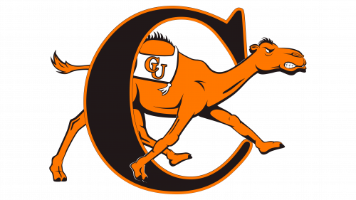
In 2008 the logo of the athletic program gets redesigned again, the “C” is back to black, but not to the square shape. The letter is executed in a bold elegant serif typeface with a rounded shape and a delicate serif with rounded angles, placed on the upper part of the line. Drawn in black, it featured a bold orange outline, balanced by a solid orange camel, which is drawn behind the “C”, walking to the right, just like on the very first badge. The drawing of the animal features the same style as the one from the previous logo, but now the animal is depicted in its full size and has a white blanket on its hump. Two intertwined “CU” letters in orange are set on the white background of the blanket.


