NTT Group is the name of the largest and one of the oldest Japanese telecommunications companies, which was established in 1953, and grew into a huge and very influential player in the world’s arena. NTT Group is headquartered in Tokyo and takes its place in the top35 world companies list Fortune Global 500.
Meaning and history
To start speaking of the NTT Group visual identity, let’s first find out what the NTT abbreviation stands for. As the company is widely known for its telecommunication technologies and activities, it won’t be a surprise to know that NTT is a derivative from Nippon Telegraph and Telephone.
Although the NTT Group has a pretty long history, its visual identity was redesigned only once, in 1985. Japan is known for its traditions and value of roots, and this is a good example of it.
1952 – 1985
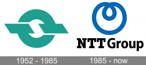
The original NTT Group logo was created in 1952 and stayed with the company for more than thirty years, which is definitely a lot. It was a bold and minimalist badge, with just a graphical emblem on it. Executed in a turquoise and white color palette, the emblem featured a stylized circle, formed by two arched lines with thick horizontal bars from one of the sides each. Those lines were standing for “TT”, “Telegraph and Telephone”, and the rounded shape of the badge — for the globe. Thus, it was a great image for depicting the essence and purpose of the company — uniting people across the world via Telegraph and telephone connections.
1985 – Today
The redesign of 1985 brought a new image to the NTT Group’s visual identity. This was also the year when the name of the company appeared on the logo. The new concept was composed of a simple blue emblem placed on the left from the lettering in plain black. This logo version was designed by the Japanese artist Yusaku Kamekura.
The blue emblem featured an abstract rounded figure, drawn in smooth arched lines with a small drop-shapes loop in its upper part. As for the logotype, it was written in a massive and strong geometric serif with that aight cuts and lines.
Font and color
The stable and brutal NTT logotype in solid black has a strong masculine character and strict square serifs. The uppercase wordmark is executed in a modern geometric font, which is very similar to such typefaces as Fantabular MVB Bold, Sutro Shaded Fill, and Mortise X-Bold. All the letters of the wordmark stand for confidence, power, and professionalism. And the black color only elevates these meanings.
The blue and white color palette of the NTT emblem adds air and balance to the massive brutal lettering. It softens the squares and adds lightness and creativity to the overall mood of the logo. Blue is also a color of trustworthiness and safety, the qualities, which take the leading positions in the company’s values list.
NTT Group icon
The abstract blue NTT Group icon symbolizes connection and unity and brilliantly shows the purpose of the company. In its color palette, the smooth drawing also evokes a sense of safety and quality, showing the customers the ability of the NTT Group to provide them with the best technologies to communicate to people all over the globe.


