Qubo is an American entertainment brand, initially established as a children’s television channel. It was owned by a consortium composed of Ion Media Networks, NBCUniversal, Corus Entertainment, Scholastic, and Classic Media. Throughout its tenure, Qubo focused on delivering educational content aimed at younger viewers. The network’s reach expanded across the US through various broadcast television affiliates. Over the years, Qubo carved a niche for itself with its unique programming blend, focusing on enlightening and entertaining its target audience.
Meaning and history
Founded in 2006, Qubo was the brainchild of a strategic alliance that included giants like NBCUniversal, Ion Media Networks, and Scholastic, among others. This collaborative venture was rooted in a shared vision of providing quality educational content to children. Some of its major achievements include the introduction of critically acclaimed shows and series that not only entertained but also educated. It hosted a plethora of programs which emphasized moral values, problem-solving, and cognitive development. Fast forward to recent times, Qubo’s journey as a stand-alone TV channel concluded in 2021. However, its legacy as a trusted source of children’s programming persists.
What is Qubo?
Qubo was an American children’s TV channel, established in 2006. Founded by a consortium including NBCUniversal and Scholastic, it offered educational and entertaining content for young audiences until 2021.
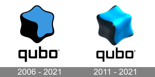
2006 – 2021
The Qubo logo, at its core, resonates with a sense of fluidity and dynamism. Featuring an abstract star-like figure, it seems to draw inspiration from both organic and geometric elements. The logo cleverly marries sharp angular points with smooth, flowing lines, suggesting adaptability and progress. The blue, nestled within the black, is evocative of a night sky with a radiant star, symbolizing guidance and aspiration. Meanwhile, the stylized and minimalistic “qubo” text beneath complements the icon above, both in its simplicity and its modern, sans-serif font choice. The inclusion of the registered trademark symbol underscores the brand’s distinctiveness and authenticity in its industry.
2011 – 2021
The second rendition of the Qubo logo has been elevated into a three-dimensional space, enhancing its modernity and depth. The black and blue star figure now gleams with a lustrous finish, showcasing its multidimensional facets. The blue, in this version, is imbued with a luminous sheen, reminiscent of a gem or precious stone. This bright blue hue not only stands out in stark contrast to its darker counterpart but also adds a touch of brilliance and luxury. Beneath it, the “qubo” typography retains its sleek and modern look, with the pronounced ‘q’ serving as an iconic representation of the brand’s name. The overall design is both sophisticated and futuristic, reflecting a brand that’s ahead of its time.


