Noom is a health and wellness company, rooted in behavior change techniques, focused on assisting users in their weight loss and fitness goals. Founded by Saeju Jeong and Artem Petakov in 2008, Noom offers a unique blend of human coaching, personalized meal plans, and interactive content. Primarily based in New York, the company has established a significant online presence and operates on a global scale, catering to users from different backgrounds and cultures. Noom’s mobile application has become increasingly popular, offering both free and premium versions.
Meaning and history
Noom, Inc., a pioneering health and fitness enterprise, was established in 2008 by co-founders Saeju Jeong and Artem Petakov. Over the years, Noom has made significant strides in the health-tech industry, distinguishing itself with its psychology-based approach to weight loss. Their emphasis on behavior change, aided by trained coaches and AI, has assisted millions in achieving sustainable health goals. Additionally, the introduction of their flagship app allowed users to monitor food intake, exercise, and access personalized advice. Now headquartered in New York, Noom has grown exponentially, with operations spread across various continents and a continuously expanding user base.
What is Noom?
Noom is a New York-based health and wellness company, renowned for its innovative approach to weight loss. Founded in 2008, the firm merges technology with psychology, offering a mobile app that emphasizes sustainable behavior change.
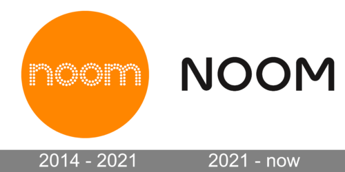
2014 – 2021
Encased within a radiant circle of bold, energizing orange, the first logo immediately captures attention. This spherical boundary suggests wholeness, completion, and continuity. The vivid orange hue not only evokes feelings of enthusiasm, creativity, and warmth, but also speaks to a brand that is dynamic and engaging.
Within this circle, the word “noom” is gracefully spelled out in a series of white dots. The choice of dot matrix styling harks back to the digital age, symbolizing precision, clarity, and innovation. Each dot can be seen as a unique entity, a pixel, a point of data, or perhaps a unique individual, all coalescing to form a bigger picture or narrative. The lower-case typography further emphasizes approachability and modernity.
2021 – Today
The second logo stands in stark contrast to the first, with its minimalist, monochromatic palette. It seems to celebrate the power of simplicity. A plain white background serves as a canvas for the brand’s name – “NOOM”, presented in bold, black capital letters.
The font choice is striking, with its thick lines and circular ‘O’s side by side, almost resembling a pair of binoculars or eyes, suggesting vision, focus, and forward-thinking. The capitalization of the letters conveys strength, stability, and authority, signaling a brand that’s both trustworthy and established. The use of black and white ensures a timeless elegance, indicating that while the brand may be rooted in tradition, it’s also in step with contemporary aesthetics.


