Lassa is a Turkish tire manufacturer primarily owned by Brisa, a joint venture between the Sabancı Group and Bridgestone Corporation. Founded in 1974, the company specializes in the production of various types of tires including passenger car, light truck, and heavy-duty truck tires. Operating mainly in Turkey, the company has extended its reach through exports to more than 60 countries. Lassa tires are recognized for their quality and durability, competing in both domestic and international markets.
Meaning and history
Lassa Tyres was established in 1974 in Turkey, a venture backed by Brisa Bridgestone Sabancı Tire Manufacturing Inc., which is itself a collaboration between Turkey’s Sabancı Group and Japan’s Bridgestone Corporation. Over the years, Lassa has grown significantly, producing a wide range of tire types including those for passenger vehicles, trucks, and agricultural machinery. One of the significant milestones for the company was its partnership with FC Barcelona in 2015 as the official tire sponsor. The company has also garnered various awards for quality and safety. Lassa continues to hold a significant share in both the Turkish and global tire markets, with products available in over 60 countries. Through consistent innovation and quality control, Lassa aims to further establish its presence on a global scale.
What is Lassa?
Lassa is a tire manufacturing company based in Turkey. Established in 1974, it is a subsidiary of Brisa, a joint venture between the Sabancı Group and Bridgestone Corporation. The company produces a diverse range of tires and exports to more than 60 countries worldwide.
1978 – 2000
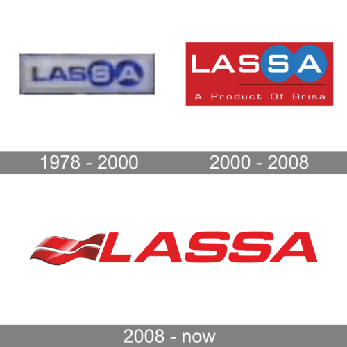
The first logo of the company was minimalistic and simple. It featured “Lassa” printed using all uppercase letters and featuring a bold, geometric, sans-serif font a unique feature of which was a letter “A” that had a straight top instead of pointed. The designers used blue, the color of trust and reliability, to print the name. The last two letters, though, were done in white and had blue circles, which represented wheels, serving as a background for each.
2000 – 2008
To print the name, the designers used a bold, sans-serif font that closely resembles BankerSquare Bold font. The characters are quite wide, which gives them a geometric appearance. It was accompanied by a tagline that said “A Product Of Brisa” printed using a more basic font, but also with the “A” having its top cut off. The white color of the inscriptions contrasted well against the red background. To add interest and a unique touch to the logo, they placed the last two letters on blue interconnected circles, similar to the original logo. There was also a thin black line that separated the name from the tagline. The logo turned out bright and memorable.
2008 – now
The company carried the red color into its new identity. It was used both for the inscription as well as a decorative element on the left. The latter consisted of two flowing stripes that reminded of a flag. A shiny gradient gave this flag-like symbol a sophisticated appearance. The font used to write “Lassa” is surprisingly similar to Eurostile Black Extended Italicized or even MicroSquare Bold Extended. It closely resembles the one used in the previous logo, but diagonal cuts were replaced by straight. Such minimal modification preserved brand recognition.


