Noggin Original is the name of a tv-network for kids, established at the end of the 1990s. Until 2009 the network was mainly based on the content for younger children but slightly changed its direction, adding a few teen programmers and series to its portfolio. Today Noggin is available as a mobile app for Android and macOS.
Meaning and history
Noggin has changed numerous logo designs throughout the years, as it was in constant search of a perfect concept. They tried pre-shook audience, school-age kids and teenagers, adding one show and removing others from the line-up. In 2008 they merged with Nick Jr but came back as a separate network in 2021. And again, with a completely new visual identity.
1999 – 2000
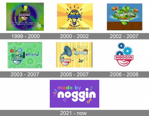
The very first logo for Noggin was created in 1999 and only stayed active for a few months. It was a very memorable and unusual badge, with the stylized man’s head on a gradient colorful background, with the horizontal rectangular banner covering his eyes. The uppercase logotype was written over the light purple banner in a bold rounded sans-serif typeface, with a solid dot inside the negative space of the letter “O”. On the man’s hat, there was a funny yellow creature standing and observing.
2000 – 2002
The redesign of 2000 introduced a new Noggin logo, executed in a bright yellow color palette. The main element of the badge was now a lightbulb turned upside down and having its rounded part stylized as the human smile. The light blue rectangular banner with the logotype on it was placed over the central part of the bulb. The image was underlined by an arched “Original” inscription in the same bold rounded sans-serif typeface, with the letters placed with a lot of space from each other.
2002 – 2007
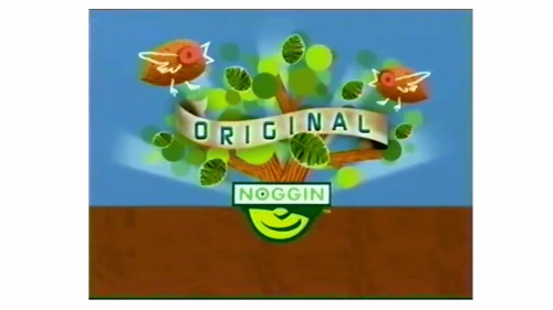
In 2002 the visual identity concept of Noggin Original was changed. The bottom half of the man’s smiling face was now drawn in green and stylized as a flower pot. Above the rectangular banner, there were colorful flowers drawn, with a few birds, and a smooth ribbon, where the green uppercase “Original” was written over. The whole composition was set on an intense background, with the deep brown table and a blue wall behind it.
2003 – 2007
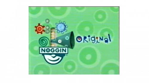
A new badge was created in 2003. Although it was only used for one project of the network, Play with Me Sesame, it stayed in use for almost four years. The new logo was executed in a green color palette, with the iconic smiley banner decorated by playful colorful elements and placed over a background with large rounded dots on it. The “Original” part of the lettering was set in a fancy custom typeface with the blue jumping letters decorated by red dots of different sizes.
2005 – 2007
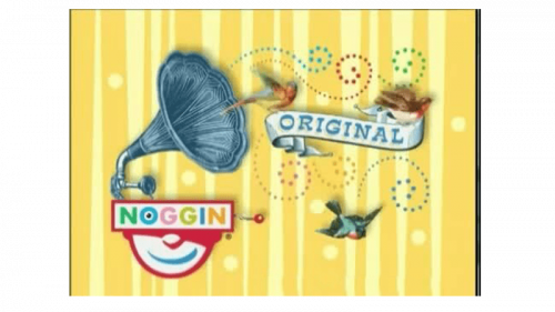
The gramophone was added to the upper part of the smiley Noggin logo in 2005. The half of the face and the rectangular banner were executed in white red and blue, while the lettering featured pastel colors, from pink to yellow. The gramophone in gray-blue had colorful swirls and birds coming out of it, and the whole composition was accompanied by a smooth white ribbon with the blue “Original” lettering on it. The badge was set on a yellow background with a vertically striped pattern.
2006 – 2008
The last logo of the first Noggin era was created in 2006 and stayed in use by the network for two years. The smiley head and the banner were set in white and contoured in smooth red. Three gears in different sizes and shades of blue were coming out of the upper part of the head. The whole composition was set on a light plain background, which made the badge look professional and confident. This was the most minimalist, yet also the most stylish of all the badges, created for the network throughout the years.
2021 – Today
After a pretty long break, the network got its second birth in 2021. The completely new logo was created to celebrate the Noggin come back. The badge of the streaming service featured a solid purple background and an extra-bold modern sans-serif lettering in the lowercase. The white “Noggin” inscription was accompanied by the “Made By” set above it and written in the same typeface, but thinner lines and smaller size, with each letter set in one of the following colors: pink, red, green, blue, and purple. There are also the same curved lines, contoured hearts, and other small elements in the same colors, set around the main wordmark.


