

![]() NLL Logo PNG
NLL Logo PNG
North America’s professional box lacrosse league for men is called the National Lacrosse League. Only the NHL and NBA have higher average attendance for professional indoor sports globally than the NLL. Unlike most lacrosse leagues, it plays games during the cold days, which continue into the spring. It is considered the biggest and busiest lacrosse tournament. In the past, the NLL has given out a lot of individual awards. The Champion’s Cup Finals, when the top two teams battle for the grand prize, serve as the annual culmination.
Meaning and History
![]()
The Eagle Pro Box Lacrosse League, as they called it back in the day, was established in 1987. The next year, it was a Major Indoor Lacrosse League, giving it a more universal meaning. There were only four teams in the NLL when it was first established. There are currently fifteen franchises in the league. The league is well on its way to becoming full-time, with the ultimate goal of having twenty to thirty teams. The game itself has a much longer and richer history. Lacrosse literally means “stick” when translated from the French word “la crosse”.
What is NLL?
Among men’s pro box lacrosse leagues, the National Lacrosse League is the biggest and most popular. Although most players come from the U.S., there are plenty of Canadian clubs.
1997/98 – 205/16
![]()
The original logo features a white silhouette of a lacrosse player with a rectangular background split diagonally into red and blue halves. The name was printed underneath using a bold serif font. The logo has a lot in common with the NBA logo presented in 1969. However, this classic version looks grander and more solid thanks to the addition of black. It is used to frame the image with the lacrosse player and as a base for the initials, which are done in contrasting white.
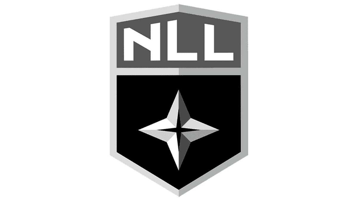
2016/17 – Today
![]()
The updated logo was presented in 2016 and looked more sophisticated. This was mainly achieved thanks to the use of a monochrome color palette. The shield with a star also enhanced the grand look. It is split in half by color and the abbreviated name is placed in the upper portion. Meanwhile, the star, which is a symbol of truth, hope, and spirit, is featured in the lower half. The full name is set to the right of the shield and split into three lines to create a more balanced overall image. This version is far more suitable for a league with a such rich history.
Font and Color
The original logo features a serif font for the “NLL” acronym. A similar font is used for the line with the full name. It resembles the Silian Rail Light font. The font set a good tone and presented the league as a professional and accomplished organization. The updated logo features a font that resembles the Galano Classic Alt Bold font.
The colors of the US and Canada are combined in the logo. Moreover, the powerful red color calls for action and is filled with passion, excitement, and confidence. The blue stands for stability and responsibility. There are also white and black, bringing a touch of strength, power, and elegance. Later, the league went for a black-and-white palette. This made the league look sophisticated and strong.


