

![]() Nirvana Logo PNG
Nirvana Logo PNG
The idea of the Nirvana logo is said to belong to Kurt Cobain himself. However, Lisa Orth mentioned, that as the Art Director for Sub Pop records she created Nirvana’s first records and their logo.![]()
Meaning and history
![]() Nirvana is one of the greatest and most influential bands in music history. Formed in Seattle in the mid-1980s, they single-handedly took alternative music to the next level when their second album “Nevermind” completely turned pop culture upside down in 1991.
Nirvana is one of the greatest and most influential bands in music history. Formed in Seattle in the mid-1980s, they single-handedly took alternative music to the next level when their second album “Nevermind” completely turned pop culture upside down in 1991.
The formation of the cult rock band Nirvana took place in 1987 in the small town of Aberdeen, near Seattle. Its members, Kurt Cobain and Chris Novoselic knew each other since the middle of the 1980s, as they went to the same school, but for a long time,the guys had no contact. Closer relations between the musicians were formed only after they began to attend the rehearsals of the local music band The Melvins.
After several unsuccessful attempts to assemble their band, Chris and Kurt meet drummer Aaron Burkhardt and create what would later become the band Nirvana. The name of the new band was proposed by Kurt Cobain himself.
The debut track “Love Buzz” was released in November 1988, and a month later the work on the album “Bleach” began. Since the beginning of Nirvana’s history, the band managed to release three studio albums, and it won’t be an exaggeration to say, that all their tracks have become iconic.
What is Nirvana?
Nirvana is the name of an iconic American rock band, which was formed in 1987. The band promoted the Grunge and Punk music styles and, with their hit “Smells Like Teen Spirit” (1991), entered the musical mainstream of the 1990s. Nirvana became the most famous band ever playing grunge.
1988 – 1989
![]()
The very first Nirvana badge was also a very simple one. It comprised an uppercase sans-serif lettering in black, with the heavy geometric characters boasting clean contours and straight lines, being perfectly balanced and evoking a sense of stability and confidence.
1989 – 1994
![]()
The very first logo for the legendary music band was introduced in 1989 and featured an intense yellow logotype, which was usually placed on a white background. The lettering in the uppercase was executed in a slightly narrowed serif typeface with sleek curved tails of some letters and solid confident contours. The yellow here evokes a sense of energy and warmth, making traditional shapes of the inscription look truly outstanding and memorable.
1991 – 1994
![]()
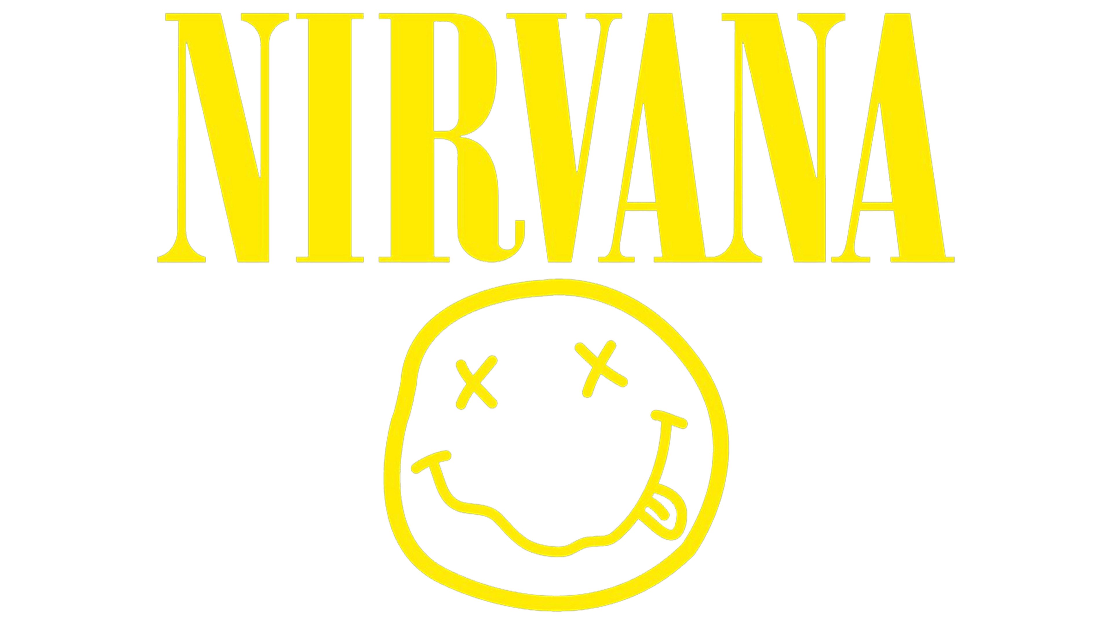
In 1991 the Nirvana logo changed its color palette to monochrome and got additional graphics to its elegant and bold logotype. The emblem of the band is now placed under the black wordmark and is also executed in black smooth lines. It is a famous Nirvana Smiley face, which is considered to be one of the most recognizable music emblems in history.
The “Smiley Face” logo was unveiled in 1991. It appeared on the flyer for the launch party for Nirvana’s Nevermind album. The same year, it appeared on the front of a Nirvana tee shirt. From that time on, the emblem, together with the wordmark, has been used as the band’s only symbol.
1992
![]()
In 1992 the badge of the band was based on italicized uppercase lettering in a simple sans-serif font with the bold lines of the characters and straight cuts. It was pretty much similar to the mood of the original Nirvana badge, but due to the inclination of the lines had a more energetic character.
No one knows for sure what the meaning behind the Nirvana logo is. Here are some of the most popular explanations:
- “Smiley” depicts the expression that Nirvana fans had on their faces during performances.
- Cobain used the emblem of The Lusty Lady strip club that was rather popular at his time. The club was located in Seattle, just 100 miles away from his hometown.
- The emblem could have been inspired by the smile on the face of Axl Rose from the Guns N’ Roses band.
- Some sources mention the “The Acid House” emblem as the source of the Nirvana logo.
- According to some people, the symbol just depicts a person who has drunk too much or has taken drugs.
- The same picture was drawn under the bridge Cobain slept under.
Font
![]()
The name of the type used for the wordmark is Onyx. There is an interesting story behind it, including two participants: Lisa Orth, who designed the band’s logo, and Grant Alden, who used to be Art Director of the label that released Nirvana’s debut album. Orth is said to have paid Alden to use the type programmed into his typesetter at that very moment, and that turned out to be the Onyx typeface.
Color
![]()
The Nirvana logo utilizes a simple, yet catchy color scheme, consisting of two colors: yellow and black. Being put side by side, they create a very energetic contrast.
Video


