A Day to Remember is a rock band based in Ocala, Florida, US. They are best known for the unique combination of metalcore and pop-punk.
Meaning and history
The band was formed in 2003 by Tom Denney and Bobby Scruggs. As of 2020, there are five members, none of them are the original members.
2004 — 2008
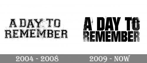
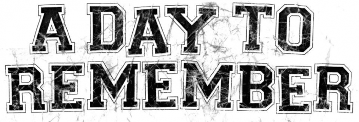
Their debut EP, Halos for Heros, Dirt for the Dead, which was released in late 2004, showcased the name of the band in an unusual style. The words appeared to have been written on the glass was now cracking. Alternatively, you could interpret it as a wall with multiple cracks.
In other words, the lettering was placed onto a surface that was being ruined. Such a style perfectly fit the image on the album cover depicting a house on fire, with prominent cracks on the columns. In front of the house, there was a man standing and looking at the fire. Behind his back, he was holding a baseball club, with which he had apparently destructed the house.
The house looked like a kind of official institution (with its columns and a heraldic bird), while the man appeared to be wearing a classic suit. Taking into consideration these facts, you could suggest that the cover depicted a man who had just ruined his employer’s office.
The same “cracked” logo was used on the covers of their second studio album, For Those Who Have Heart (2007), again paired with a man holding a baseball club.
2008 — Today
The third studio album, Homesick, which was released in 2009, showcased a heavier ADTR logo. Similar to the “cracked” logo, this one also featured the name of the band broken down into two lines. You could even notice the same “cracked” or “ruined” effect.
Nevertheless, this was a drastically different design. The serifs disappeared leaving simpler letters. The shape of the glyphs grew more elongated, although the type was now bolder. While the surface behind the letters was “damaged,” you could also see something that looked like drops of white spray paint on the letters. So, you could suggest that the building “ruined” in the debut album was being renovated.
And again, the A Day to Remember logo perfectly fitted the name of the album, which implied that someone wanted to get back to the things he had abandoned.
Additional “wild” logo
The Attack of the Killer B-Sides LP released in 2010 had a cover with a different wordmark. Here, the letters were casual and looked as if they had been drawn by hand in a great hurry. The shape of the letters echoed the appearance of the monster depicted next to the wordmark.


