 Nippon Professional Baseball Logo PNG
Nippon Professional Baseball is the top baseball league in Japan. 12 of their major teams compete in the tournament every season, ever since the first season in 1950. Before then, baseball had a moderate presence in the country. After the Second World War, the sport grew in popularity thanks to the American presence in the country.
Meaning and History

The league was started in 1950 by several American teams that comprised the former Japanese Baseball League, which existed since 1936. The current league is largely the successor of JBL. The word ‘Nippon’ in the name means ‘Japan’, translated from Japanese and written in Latin letters.
1950 – 1970s

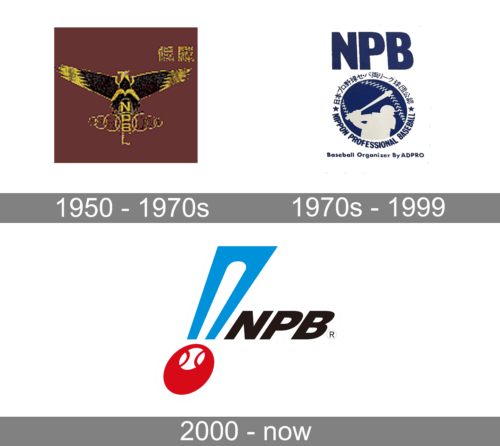
Although this looks quite dark, it has something grand and powerful about it. The black, golden, and crimson colors greatly contribute to this impression. The logo also has a majestic bird with its wings spread at the top of the vertically stacked “NPBL” initials. The two middle letters fall in the center of a golden ring with three more rings on either side of it.
1970s – 1999

In the 70s, the new emblem depicted the initials done in dark blue, sans-serif font placed above a round emblem. The round emblem had a baseball ball as the base with a silhouette of a baseball player with a bat drawn in front of it. The Japanese version of the name framed the upper half of the ball, while an English translation was placed around the bottom half. The logo had a professional appearance and followed a traditional pattern for sports logo design. Yet, there aren’t that many sports logos that feature a name printed in two languages at once.
2000 – Today

One of the principal elements of their classic logo is the acronym ‘NPB’. It’s written in big, black letters using a tilted sans-serif style. The font is a pretty basic typeface with classic proportions and parameters.
To the left of the abbreviation, they placed a tall turquoise trapezoid. Its right side went parallel to the left side of the letter ‘N’. Its middle was occupied by a big white imprint of a baseball bat. Directly below it, there is a red circle. It looks stretched downwards and a bit to the side. Near its top edge, there is a white dot with two red curves on each side, resembling a ball. This whole composition is supposed to look like an exclamation mark.


