Indian Premier League Logo PNG
Indian Premier League, or IPL, is the professional men’s cricket league, which was established in India in 2007, and had its first season played in 2008. Today IPL is the most watched cricket league in the world.
Meaning and history
The Indian Premier League cricket is a world-class tournament, which was established in 2007 for men’s cricket teams competition. Its matches are held annually between March and May and feature ten teams from different cities across the country. The Indian Premier League is the most watched cricket league in the world and is the sixth most watched of all sports leagues in the world. In 2010, it became the first sporting event in the world to be streamed live on YouTube.
Founded by the Board of Control of Cricket in India (BCCI) on the initiative of Lalit Modi, who became the first commissioner of the league.
What is the Indian Premier League?
Indian Premier League is a professional cricket league in India, which consists of ten teams from seven different cities and three states. The league was established in 2007 and has Mumbai Indians as the club, which won the most titles in IPL history.
As for the visual identity, the league has been very consistent with its logo, with just one major redesign in the middle of 2008. The current badge of the Indian Premier League varies depending on the sponsor. The sponsor’s icon is usually set above the “IPL” abbreviation in its corporate color palette and style.
2008
The original badge of the Indian Premier League was introduced at the beginning of 2008 and only stayed active for a few months. The logo was composed of a graphical emblem depicting a cricket player with a bat, drawn in solid blue color on the left from the two-leveled lettering with the sponsor’s icon and the enlarged “League” under it, while the “Indian Premier” was set in small capitals under the silhouette of a player.
2008 — Today
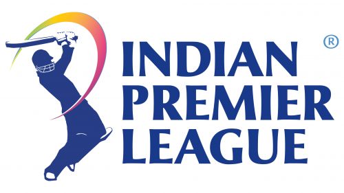
The redesign of the Indian Premier League badge held a few months after the introduction of the first logo, added lightness and brightness to the IPL visual identity, expanding its color palette, and making the badge look more dynamic. The new concept features a lighter player’s silhouette with a colorful orbit coming out of the bat. As for the lettering, it was now set in three levels on the right from the emblem, with all characters in the same size and style. When used with the sponsor’s insignia, the full name of the league is replaced by a bold blue abbreviation.
Sponsorship Logos
2009 – 2012
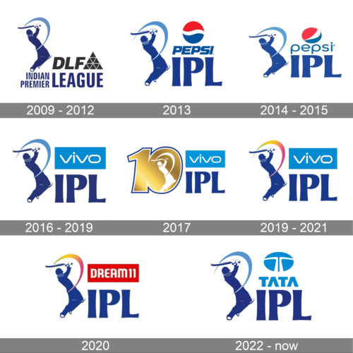
In 2009 the Indian Premier League started being sponsored by DLF, a real estate developer. So the official logo of the league was accompanied by the corporate badge of the sponsor; the dark-gray uppercase lettering in sans-serif with a geometric emblem, featuring a large triangle formed by nine smaller ones.
2013
For the 2013 season the Indian Premier League for a new sponsor, the world-renowned company Pepsi. Its blue and red logo replaced the DLF one, being placed above the uppercase “IPL” lettering. However, this badge design was only in use for one season.
2014 – 2015
Pepsi has stayed the Indian Premier League sponsor for another two seasons, but after the company’s rebranding the logo of IPL had to be changed too. Its location remained the same, but now the emblem was placed above the lettering, which switched from the bold uppercase to a medium-weight lowercase. The emblem was also slightly changed, with the main difference in the white segment of the famous globe.
2016 – 2019
In 2016 the main cricket league of India got a new sponsor, Vivo. Its delicate blue banner with the lightweight white logotype was placed above the “IPL” lettering with no additional elements. The logo looked very balanced and fresh and stayed like that for three seasons.
2017
The redesign of 2017 was dedicated to the tenth season of the Indian Premier League. The right part of the logo stayed untouched, while the iconic emblem with the blue silhouette of a crochet player was replaced by a glossy gold drawn “10” in a double white and blue outline, with the player’s image drawn in white, replacing the negative space of the “0”.
2019 – 2021
In 2019 the logo from 2016 came back with a slight difference. It was the light-blue ball trace from the emblem replaced by the rainbow gradient one. This small change has made the whole logo look different — more lively and vivid, and still the concept remained the same, reflecting the confidence and heritage of the league.
2020
A new sponsor, Dream 11, came to the league in 2020 and the logo of the championship was changed respectively. The blue cricket player with the rainbowish trace of a ball is accompanied by a solid red horizontally oriented rectangular banner with the white “Dream 11” inscription in the uppercase of a modern sans-serif typeface.
2022 – Today
The world-famous TATA company became the sponsor of the Indian Premier League in 2022, so the logo of the tournament had to be changed again. Apart from the red Dream 11 banner being replaced by the light-blue Tata one, the rainbow-arched stroke of the emblem turned light blue again, supporting the corporate badge of the new sponsors.
Font and color
The bold uppercase lettering from the primary badge of the Indian Premier League is set in a modern and elegant sans-serif typeface with the bars slightly flared and sharpened to the ends. The closest fonts to the one, used in this insignia, are, probably, Optima Nova Black and Alinea Incise Bold, but with the contours slightly modified.
As for the color palette of the Indian Premier League visual identity, it is based on a calm and pleasant shade of blue, which is used both for the emblem and the lettering, and accompanied by a rainbow scheme of the orbit, composed of green, yellow and pink shades, and making the whole image look voluminous and energetic.


