Nickelback is a Canadian alternative-rock band, which was created in 1995 and is one of the most recognizable and popular music bands of its country. Nickelback sold over 50 million of albums across the globe.
Meaning and history

The band Nickelback emerged in 1996 in the small Canadian town of Hanna. It was formed by brothers Chad (vocals, guitar) and Mike (bass) Kruger, their cousin Brandon (drums) and Ryan Peake (guitar). However, Brandon Krueger soon left the band. The musicians had to look for his replacement. Before Ryan Vickdale was found, six drummers changed in the band.
For quite a long time the musicians could not think of a suitable name and went through several options. Before becoming Nickelback, the Canadian quartet was called Brick, earlier – Village Idiot, and the very first name of the band was Point Of View.
The band also didn’t decide its musical style at once. At first the musicians only performed cover versions of other bands. But they were not very successful. Besides, the band wanted to achieve real fame long time ago. However, they needed to record something of their own. Chad Kruger came up with the idea
That same year, 1996, the guys recorded their first demo album, “Hesher”, which was followed by a series of concerts in Canada. It did not include many songs, but it finally put an end to all the tired cover songs.
What is Nickelback?
Nickelback is the name of a Canadian rock band, founded by the Kruger brothers in 1995 in the provincial town of Hanna. Nickelback is among the top early 21st century rock bands according to music industry magazine Billboard. The band’s work tends toward alternative rock, and their concerts have been drawing crowds of thousands of people anywhere in the world for more than a decade.
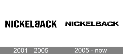
2001 — 2005

The logo, used by Nickelback until 2005, was designed in 2001. It featured a custom black logotype in the uppercase, with the letter “B” mirrored. The bold black letters of a sans-serif typeface boasted traditional solid shapes, though had their texture and pattern uneven, and some of the bars’ ends slightly torn. This was what made the whole badge very special along with the turned “B”.
2005 — Today
The band’s name, Nickelback, tells a lot about its musicians and their values. The world is synonymous with defense and support. But the band’s history says the name was given by Mike Kroeger, who worked in Starbucks and called the change “a nickel”.
The Nickelback logo is a powerful and confident wordmark in all-caps. The lettering is executed in a sans-serif font, which is similar to Decrepit, designed by Enigma Fonts.
The clear and neat lines of bold wordmark make the logo strong and bright, especially with its monochrome palette. The uneven color of the letters makes the logo look alive and dynamic. You can imagine how the letters disappear and appear again when looking at it.
The Nickelback logo is a perfect example of minimalist and stylish visual identity, perfectly reflecting the band’s music genre and vision.
Font and Color
The bold uppercase lettering from the primary Nickelback logo is set in a heavy and extended sans-serif font with interesting erased texture of the characters and very thin stencils in some of the letters. The closest fonts to the one, used in this insignia, are, probably, Letterpress Aurora, or Draft Natural A Black, with some minor modifications of the contours.
As for the color palette of the Nickelback visual identity, it is based on strict gradients from white to black, which looks very masculine and even brutal, at the same time creating an elegant timeless look for the massive uppercase logotype.


