Def Leppard, the quintessential British rock ensemble established in the late ’70s, soared to acclaim with their unique fusion of hard rock’s edge and heavy metal’s intensity. Celebrated for their vivacious stage shows and pioneering music videos, they became emblematic of the ’80s auditory landscape. Their 1987 magnum opus, “Hysteria,” broke records, spawning anthems such as “Pour Some Sugar on Me” and “Love Bites”. With a dedicated following and a saga marked by overcoming adversity, Def Leppard continues to shape the rock genre, capturing the quintessence of their time while maintaining an enduring allure.
Meaning and history
Def Leppard, a seminal British rock band, emerged in 1977 in Sheffield. The original lineup, including Joe Elliott, Rick Savage, Pete Willis, and Tony Kenning (soon replaced by Rick Allen), was solidified with Steve Clark’s arrival. Their debut album, “On Through the Night” (1980), introduced their heavy metal style. The follow-up, “High ‘n’ Dry” (1981), featuring “Bringin’ On the Heartbreak”, began their ascent, particularly in the U.S.
Their breakthrough came with “Pyromania” (1983), blending hard rock with polished production, yielding hits like “Photograph”. This era saw Phil Collen replace Willis, enhancing their musical depth. The pinnacle of their success was “Hysteria” (1987), with chart-topping hits like “Pour Some Sugar on Me” and “Love Bites”. This period was marred by challenges: Rick Allen’s car accident, resulting in the loss of his arm (he remarkably continued as their drummer), and the untimely death of Steve Clark in 1991, with Vivian Campbell joining subsequently.
The 1990s marked a shift in the music industry, with grunge’s rise impacting Def Leppard’s prominence. Albums like “Slang” (1996) and “Euphoria” (1999) reflected their attempts to adapt to changing tastes.
Entering the 21st century, Def Leppard continued to record and tour, maintaining a robust fan base. They released albums like “X” (2002), “Songs from the Sparkle Lounge” (2008), and a self-titled album in 2015, exploring various musical styles while honoring their hard rock roots.
Despite the shifts in music trends and personal hardships, Def Leppard’s enduring appeal lies in their resilience, adaptability, and a catalog of iconic songs. Their influence extends beyond their music, as they symbolize the spirit and evolution of rock across decades. Their journey, marked by triumphs and tragedies, cements them as a resilient and influential force in the rock music realm.
What is Def Leppard?
Def Leppard, a band that became a cornerstone of British rock, carved out a niche in the evolution of hard rock and glam metal. Emerged from Sheffield, England in 1977, they ascended to prominence in the 1980s, especially with landmark albums such as “Pyromania” and “Hysteria.” Their catchy melodies and dynamic stage presence enthralled a global audience. The band’s enduring journey, marked by adaptability and perseverance, has etched their name as enduring figures in the annals of rock music.
1979
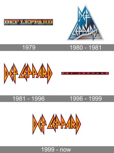
The logo presents a bold, stylized rendition of the name “Def Leppard,” renowned for its association with the famed rock band. Each letter is distinctively crafted, featuring a multi-colored, gradient fill that transitions through a spectrum of warm hues—reds, yellows, and oranges—reminiscent of vibrant sunsets. The contours of the letters are black, creating a striking contrast that enhances their visual impact. This graphic design is a throwback to the classic rock era, embodying the band’s energy and the flamboyant aesthetics of the late 70s and 80s. The font itself is playful and irregular, with varying shapes and sizes that give a dynamic, almost rebellious character to the overall image, aligning with the band’s electric and unconventional musical style.
1980 – 1981
This logo is a stark departure from the earlier multi-colored design. Dominated by a geometric, triangular motif, it embodies a modern, almost futuristic aesthetic. The color palette is cooler, with shades of blue creating a sense of depth and dimensionality. Silver and gray accents add a sleek, metallic finish, suggesting a more sophisticated, industrial vibe.
The band’s name, Def Leppard, is fragmented into angular components, reflecting a stylized, abstract interpretation of their identity. This design forges a connection to the edgier, more experimental phase of the band, evoking a sense of progression and a break from tradition. The sharp angles and clean lines impart a feeling of precision and forward-thinking, resonating with the band’s evolution in sound and image during the early 80s.
1981 – 1996, 1999 – Today
The updated emblem for “Def Leppard” has been creatively redesigned, now showcasing a tri-color scheme with angular alphabets. This fresh interpretation of the band’s iconic symbol blends contemporary aesthetics with a nod to their classic style. The letters in the logo are structured in a bold, geometric fashion, offering a striking visual appeal that captures the essence of the band’s dynamic and evolving identity. Each letter is carefully crafted to stand out, with sharp angles and a distinct color palette that adds depth and dimension to the design.
This modern take on the logo is not only a tribute to the band’s rich history but also a representation of their continuous innovation and relevance in the music industry. The colors chosen are vibrant yet harmonious, creating a balance between energy and sophistication. This new logo is a testament to the band’s enduring legacy and their commitment to staying at the forefront of musical and visual artistry.
1996 – 1999
The logo is a sleek and modern interpretation of a classic brand. It features a rich, deep burgundy backdrop, overlaid with subtly lighter, almost metallic angular letters that spell out the name in a horizontal layout. The letters exhibit a sharp, geometric design, creating a sense of cutting-edge precision. Each character is distinct, with a unique edginess that suggests a contemporary flair while retaining a strong connection to the band’s heritage. The typographic style is bold and assertive, with clean lines that convey a sense of forward momentum and strength.
The choice of color adds a layer of sophistication and depth, with the darker hues conveying a sense of the classic rock essence the band is known for. The overall effect is one of polished professionalism, evoking the band’s storied past while also pointing towards a future filled with possibility and ongoing relevance in the music scene.


