

![]() Scorpions Logo PNG
Scorpions Logo PNG
Scorpions is the name of a famous German hard-rock band, which was created in 1965 by Rudolf Schenker. The most popular band’s group is “Wind of Change”, which is an anthem of the Berlin Wall’s fall.
Meaning and history
![]()
The Scorpions, later to become one of the world’s most popular hard rock bands, were founded in 1964 in Hannover, Germany, by Rudolf Schenker.
In 1964 the young German guitarist Rudolf Schenker founded his first band Nameless, inviting his younger brother Michael, who at that time was absolutely unfit for professional music due to his young age. Soon the band was renamed Scorpions.
Michael did not stay in Rudolf’s band, but soon joined Copernicus, where Klaus Meine was the vocalist. In 1969, the older brother managed to bring Michael back into the band, and with him, Klaus joined, and since then he became the author and performer of almost all the rock band’s hits.
From the very beginning, the group’s founders focused on the international scene, not wanting to limit themselves to German experimental rock music.
In 2017 the band was included in the hall of heavy metal history. The members from the current and past lineups have been rightfully recognized as the best in their genre on numerous occasions.
1972 – 1975
![]()
The band’s first logo was nothing more than their name written in black letters using a simple font with small serifs all over the letters.
1975 – Today
![]()
During the first year after it was formed, the band was called “Nameless”, as they couldn’t find a proper name. The idea of ”The Scorpions” came to Rudolph Schenker, because of its strength and memorability.
The Scorpions logo is composed of a wordmark and an emblem above it. The emblem features a detailed image of a scorpion with sharp lines of its claws.
![]()
The wordmark in all-caps is executed in a custom font that is close to Lady Starlight, designed by Typodermic Fonts Studio. The unique smooth and bold lines of the typeface make the logo instantly recognizable.
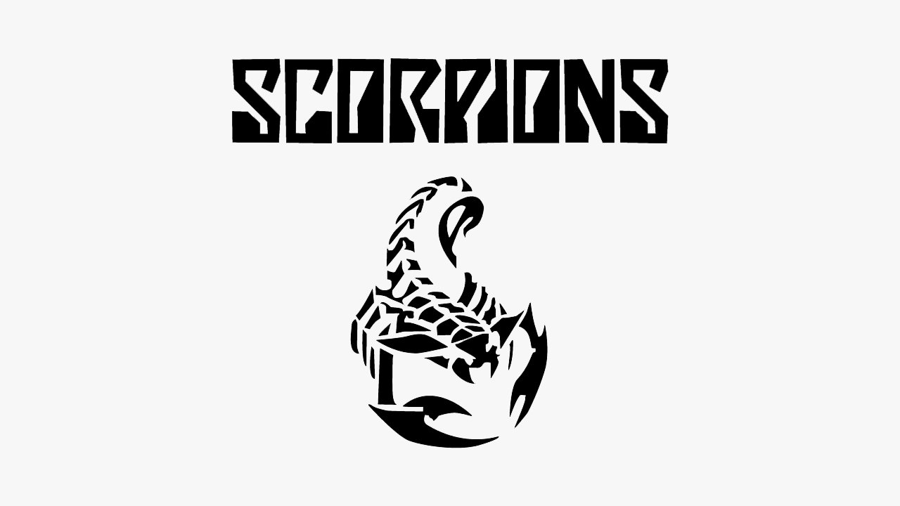
The monochrome palette of the logo makes it powerful and masculine, with an elegant and timeless touch. It is a symbol of music quality and a celebration of the iconic band’s style.
Font
The custom and recognizable style of the uppercase Scorpions logo is set in a fancy designer typeface with narrowed contours of the characters, and interesting thickened and rounded ends of some bars. The closest fonts to the one, used in this insignia, are, probably, Minicomputer Semi Bold or Bold ones from the same family, but with some significant modifications of the characters’ contours.
As for the color palette of the Scorpions’ visual identity, it is based on black lines, which are usually set against a plain white background. This color allows for placing the logo of the band on various backgrounds and for various needs, at the same time it is a symbol of quality and precision, an indicator of great taste, and a perfect representation of the band’s music style.


