Nick at Nite is a nighttime programming block broadcast on the Nickelodeon channel, owned by ViacomCBS. Launched in 1985, it primarily features syndicated reruns of classic television sitcoms and drama series, catering to adult and teen audiences. Nick at Nite operates in the United States but has also had various international versions. Over the years, it has become a beloved destination for those seeking nostalgic TV programming, making a significant imprint in cable television history.
Meaning and history
Nick at Nite was introduced in 1985 as a nighttime service of Nickelodeon, established by Warner-Amex Satellite Entertainment. Initially, it showcased reruns of older network TV shows, targeting a more mature audience in contrast to Nickelodeon’s youth-oriented daytime programs. Throughout its history, Nick at Nite has achieved remarkable success, celebrating anniversaries, expanding its lineup, and initiating original programming. As of the latest data, Nick at Nite continues to be a pivotal player within ViacomCBS’s lineup, offering vintage and contemporary shows, cementing its reputation as a haven for classic TV lovers.
What is Nick at Nite?
Nick at Nite is an evening programming segment on the Nickelodeon channel, predominantly airing classic television shows. Launched in 1985, it’s owned by ViacomCBS and caters to both teen and adult audiences, serving as a nostalgic trip through television history.
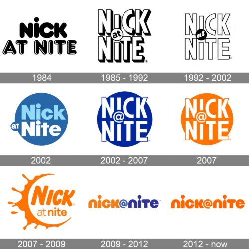
1984 (pre-launch)
A captivating blend of simplicity and modernity, this “Nick At Nite” logo fuses a chunky, rounded typeface with clear visual distinction. The playful dot on the ‘i’ stands out, adding a touch of whimsy to an otherwise straightforward design. The use of varied letter thickness offers depth and contrast, making the design pop. The contrasting bold “Nick” and hollowed “At Nite” speaks volumes about the brand’s dual nature – playful yet mature, contemporary yet timeless.
1985 – 1992
The interlocked “Nick At Nite” design is an artful representation of unity and interconnectivity. Each letter snugly fits into the other, symbolizing coherence and synergy. The prominent ‘at’ in a circular overlay ties the words together, creating a bridge between ‘Nick’ and ‘Nite’. The bold linear font combined with precise geometry evokes a sense of structure, rhythm, and balance. The registered trademark symbol adds an authentic touch, underlining the brand’s established and reputable presence. The chunky letters with subtle shadowing lend a 3D effect, providing depth and dimension to the overall design, making it both memorable and visually delightful.
1992 – 2002
A masterful fusion of typography and design, the “Nick At Nite” logo features an intricate interplay of bold, linear letters. The central “at” within a solid circle serves as an anchor, linking the overarching “Nick” and “Nite” with a seamless transition. The overall structure exudes both complexity and harmony, with each character fluidly connecting with the next. Enhanced by the presence of the registered trademark symbol, this design embodies both authenticity and modernity in equal measure.
2002 (unused)
Housed within a tranquil blue circle, the “Nick At Nite” logo stands out with its contemporary and clean design. The gradient shift from deep to light blue suggests the smooth transition from evening to night, perfectly resonating with the “Nite” concept. The use of diverse font thicknesses and strategic spacing emphasizes the uniqueness of each word while maintaining a cohesive appearance. The overall emblematic form encapsulates the essence of nighttime entertainment.
2002 – 2007
With a backdrop of deep royal blue, this variation of the “Nick At Nite” logo immediately commands attention. The white typography sharply contrasts the background, ensuring legibility and prominence. The creative placement of “@”, nestled within the confines of the “I”, showcases the brand’s innovative approach to design. Its circular form, further solidified with the bold encasing lines, projects a sense of unity and wholeness, indicative of comprehensive entertainment.
January – September 2007
Vibrant and energetic, the orange “Nick At Nite” logo version breaks the mold with its audacious color choice. This hue not only captures the viewer’s eye but also evokes feelings of warmth, reminiscent of twilight hours. The layout remains faithful to the emblematic design, with the “@” creatively positioned within the “I”. With the registered trademark symbol intact, this rendition is a testament to the brand’s versatility and adaptability, thriving in varying color palettes.
2007 – 2009
This lively rendition of the “Nick At Nite” logo exhibits an adventurous splash, reminiscent of a sunburst or paint splatter. The vibrant orange backdrop symbolizes energy, warmth, and creativity. With the bold “Nick” typography seemingly flowing into the “at nite”, there’s a playful dynamic between the elements, giving the design a sense of movement. The circular splash around the “at” uniquely marries the brand’s name within its logo, resulting in an emblem that’s both imaginative and memorable.
2009 – 2012
The “Nick At Nite” logo elegantly plays with color contrasts, using a harmonious blend of orange and blue to convey its message. The distinctive “@”, nestled between “nick” and “nite”, acts as a visual bridge, connecting the two primary words. With a contemporary twist on typography, the logo uses varying font sizes and a unique rendition of the “@” symbol to create a modern, fresh appeal. The bicolor approach not only enhances readability but also adds a touch of sophistication.
2012 – now
Bathed in a radiant orange hue, this “Nick At Nite” logo variation emphasizes continuity. The fluid design, highlighted by the seamless flow of the lowercase letters, conveys a sense of unity and progression. The standout feature is the stylized “@” symbol, which merges effortlessly with the surrounding letters, creating a bridge-like structure between “nick” and “nite”. This continuous flow, paired with the brand’s signature color, results in a logo that’s both cohesive and eye-catching.


