

The Dutch mobile carrier T-Mobile, a former subsidiary of Deutche Telekom in the Netherlands, is carrying out a rebranding. From now on, the company will operate under the name of Odido. This change, however, appeared to be unexpected for many, raising some questions.
![]()
While the company used light red in its previous visual identity, the rebranded Odido now maintains a bright and bold color palette. In addition, the brand’s simplified forms implemented in the new logo demonstrate a serious approach.
Interestingly, the new name is a palindrome, a word that you can read the same backwards as forwards. According to the company’s brand book, the letters in “Odido” are described as “open, playful, and unique characters on their own, but they together create a stronger unity”.

The rebrand in general is the result of the brand’s commitment to stay relevant and innovative in this very competitive industry. The new name is not just remarkable; it was developed considering SEO rules, which ensure drawing attention in an overcrowded market. In terms of branding, this solution represents a semiotic shift toward simplicity and catchiness, a trend that is increasingly recognized in a visually saturated world.
Facing these changes, the customers of the company showed a mixed reaction. “I see it as a circle – a semicircle – a rectangle – a semicircle – a circle”, a user commented on X. Others believe the logo reminds them of the buttons “Play” and “Record”, a depiction of the moon cycle, a medal strap, or a DJ turntable.
![]()
In addition, the carrier’s subscribers were dissatisfied that the new brand emerged so suddenly, with no announcement. Indeed, Odido was created almost in secrecy. The main role in this process was played by Amsterdam-based design agency Neboko. The rebranding also involved six other companies that were responsible for technology, digital strategy, content management, and interior design.
According to the design team, the name and logo are an expression of inclusivity and diversity. Aesthetically, the emblem benefits from its symmetrical name, showcasing an eye-catching, minimalist approach. Given the brand’s sound and visual simplicity, as well as the general attractiveness of the design, the branding can be named a total win.

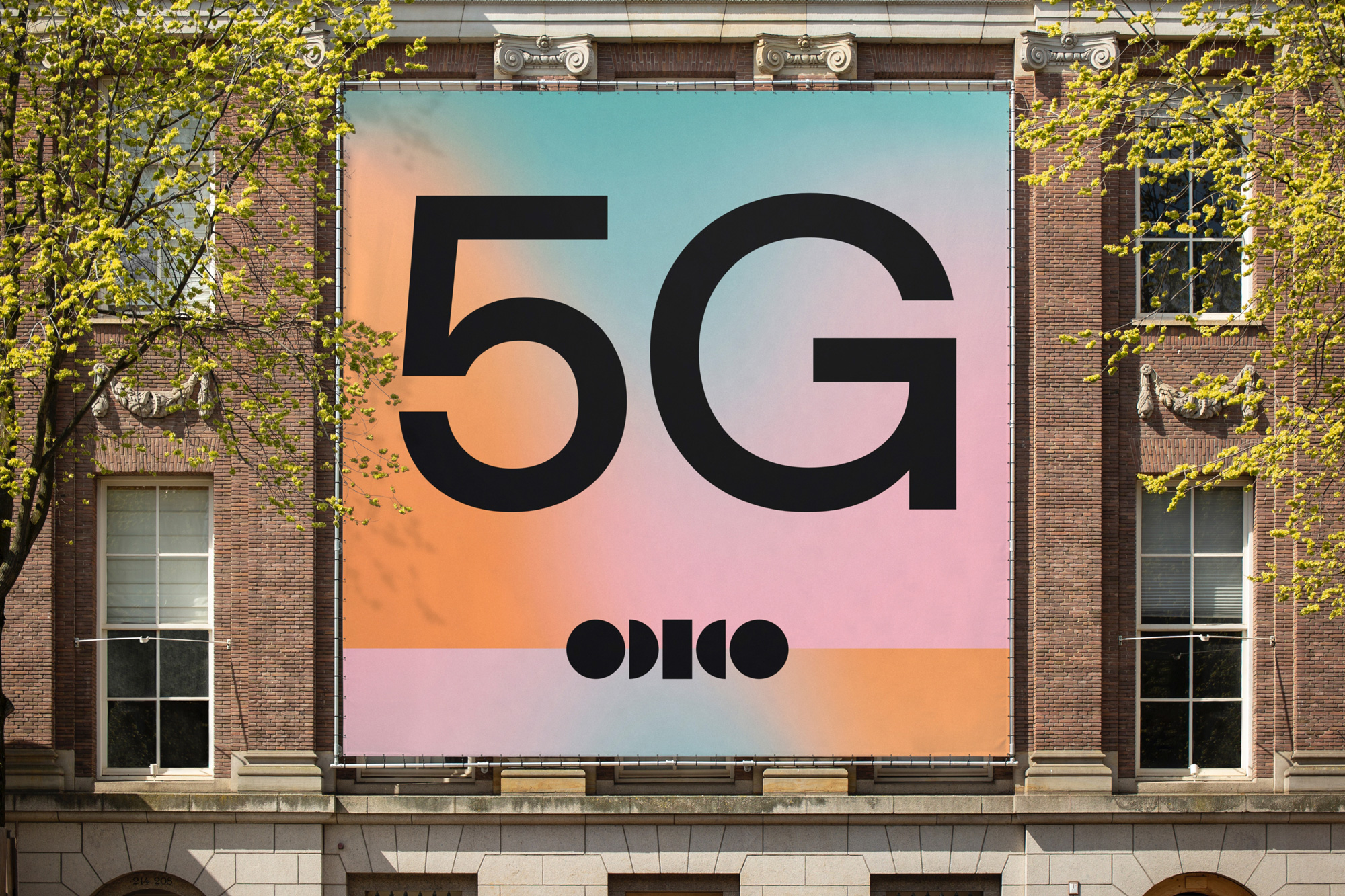
Besides the base black-and-white version, the logo will be displayed in different colors, representing a broad color palette that supports the theme of inclusivity as well. The gradient design, including light, matted shades of blue, orange, and green, does a great job, being a good symbol of bringing people together.
The visual identity also includes a custom sans typeface named Optical, which comes in different weights and styles for headlines and body texts. Distinguished by cornered and beveled letterforms, it combines humanist and geometrical styles.
By giving an opportunity to switch between the monochrome and colored versions of the logo, the identity is perceived quite comfortably. Such a solution is definitely a breakthrough in terms of branding. Unlike other brands that bet on repeating one version of the emblem, Odido chose to use a variety of graphic images to promote its services.


