Founded in 1971, the Bronx Museum of the Arts is a unique artistic space dedicated to contemporary art. Exhibiting a collection of more than 2,000 works, the museum calls its mission “connecting diverse audiences to the urban experience through special exhibitions and education programs. Aspiring to clearly articulate the ideas of capturing the modern culture as well as the spirit and tenacity of The Bronx, BxMA has unveiled a new visual identity created by the New York-based design studio Team.

The Bronx itself gave inspiration for the museum’s updated look as this is NY’s only borough with “The” in its name that consequently, can be considered a sign of uniqueness, boldness, and solidity. So Team created an identity that laconically expresses these notions corresponding with the heritage and philosophy of the Bronx Museum.

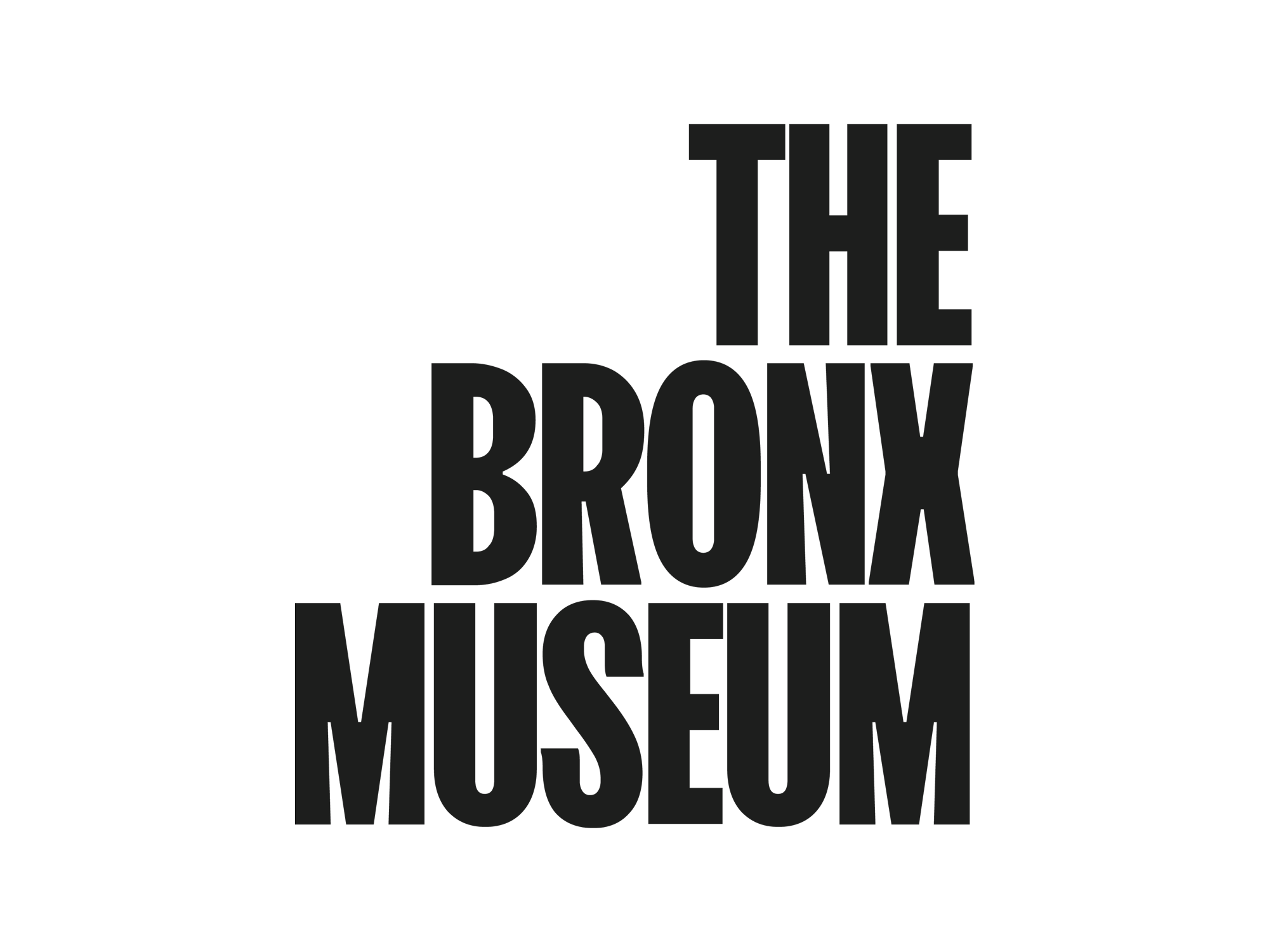
The BxMA brand has received bold typography with a logo representing the institution’s name that can be used as a stylish decoration in exhibitions, promotions, and programs. Taken from the FK Screamer font family, the typeface, used for the nameplate, is chosen to convey the borough’s role in the cultural life of New York. This approach is also supported by a set of soft colors.
The museum previously had quite an original logo featuring an orange-highlighted ligature of an “X” and an “M”. Although it was the crucial thing when it was created, it looks a bit amateurish and awkward, especially with those wide letters, from the point of view of today’s logo design standards. The new logo with its seeming simplicity, on the contrary, creates a fresh typographical system where the “THE” is an anchor for “BRONX MUSEUM” as can be seen in the brand’s visual materials as well as on the BxMA website.

Overall, Team has succeeded to create a flexible branding that will perfectly work for all the activities of the museum. The bold design is quite suitable for the artistic spirit of The Bronx.


