

On December 7th 2017, the NHL commissioner Gary Bettman announced Seattle had been granted the right to file an extension team application which was eventually approved in late 2018. After that, Seattle Hockey Partners, the team’s owning company, launched a process of voting on the name and logo for the Seattle team. Recently, both the name and its emblem have been presented to the public.
The team’s attributes were unveiled at a special event under the motto “Release the Kraken!”. Reportedly, 13 names, including the Cougars, Eagles, Emeralds, Seals and others, were registered to choose from. But most of the fans have voted for the Kraken. So, the Seattle Kraken, named after a sea monster from Norwegian folklore, will join the NHL Western Conference for the 2021-22 season. Moreover, it will be the city’s first hockey team in the NHL after the Seattle Metropolitans, the 1917 Stanley Cup winner, were folded in 1924.
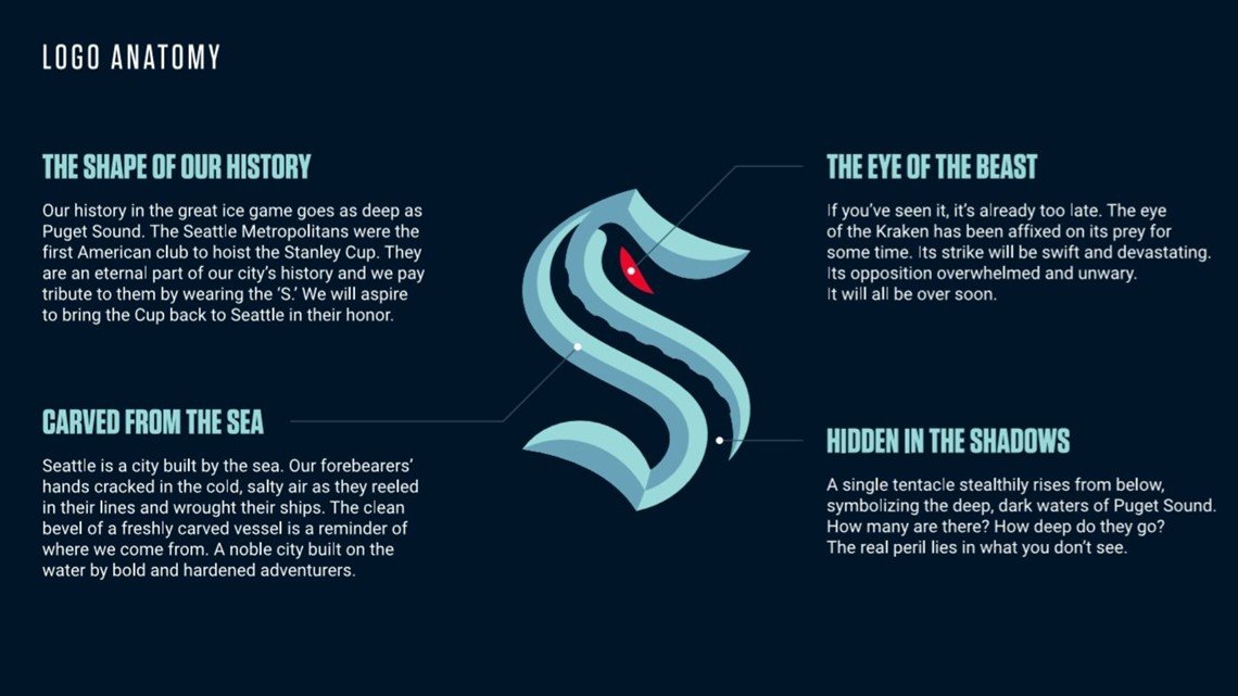
Created in cooperation with Adidas, according to some information, the Kraken’s logo, formed as a big “S”, seems to be an illustration of the legendary cephalopod, while paying a tribute to Seattle, its history as well as the Metropolitans. The distinct elements here are the red eye and the single tentacle – the details celebrate the mythical octopus and symbolize the dark waters of Puget Sound located near Seattle.

While the logo features two shades of blue (ice blue and shadow blue), two more tints of blue (deep sea blue and boundless blue), along with red alert, were declared as the team’s official colors. As the NHL relations director Nic Corbett, who was involved into the Kraken’s branding, said, the blues can provide the sense of confidence to the players.


