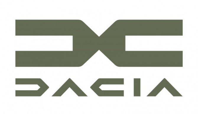
In February, we could see an allegedly new logo of Dacia that leaked online amid the talk of Renault’s renovation program. Recently, the French automobile manufacturer has officially presented the full version of Dacia’s emblem including a wordmark. Refreshing its Romanian asset, Renault hopes to strengthen the brand’s competitiveness and profile, broadening its model range to new segments.
At the moment, the multinational company is demonstrating a lot of movements. The car brand of Renault itself was updated back in March. A few weeks later, the parent Renault Group also unveiled its new brand identity. Now, it’s Dacia’s turn to get visually upgraded.

So, the mark says goodbye to the chrome-like emblem which was introduced in 2008. Instead, Dacia will use a symbol made up of the abstractly stylized letters “D” and “C”. The geometric typography, purposely diminished, reflects Dacia’s essence and designates the most important things in the car industry, according to the company. The merging letters convey the feeling of movement due to their arrow-like shape.
Earthy colors will prevail in Dacia’s visual identity. The green khaki is chosen as the main brand color. It is intended to emphasize the “street spirit” of the mark in such new models as the crossover Duster and concept SUV Bigster which were presented early this year.
The brand’s typography face is also represented by the Dacia Spirit typeface, designed in the same cornered and technical style as the DC logo. It is used for the Dacia wordmark. In addition, the new identity is complemented by the slogan “Follow your essential”.


