

While such brands as Sagrotan, Durex or Vanish enjoy their popularity among consumers, the name of their parent company Reckitt Benckiser, that was founded more than 200 years ago, is less known. The British consumer goods manufacturer is seeking to change the situation through its new visual identity.
Refreshing its look, the company has dropped the second half of its name which appeared after the UK’s Reckitt & Colman merged with the Dutch company Benckiser in 1999. The rebranded Reckitt considers its new corporate identity, including a logo and some other visual elements, as an important step in the company’s ongoing transformation towards sustainable development. Reckitt’s visuality is intended to be more recognizable and reflect the company’s aspiration for better health care, protecting and education to make a clearer and healthier world.
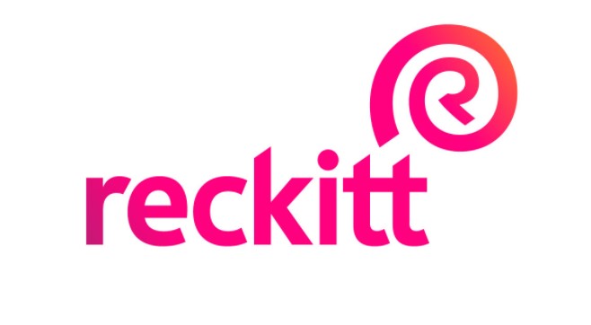
Reckitt’s new logo features a lowercased wordmark accompanied by a peculiar R symbol that, according to the company, means strength, unity as well as the manufacturer’s purpose to heal, protect and nurture. These values have to be evoked by the shell-like design of the Reckitt symbol, referring to nature itself.
Reckitt has also presented its refreshed color palette which includes Energy Pink, used for the emblem, as a brand color as well as 12 secondary colors symbolizing the brands of the company. In addition, Reckitt’s promotional materials will be displayed with the Energy custom typeface for clearer and more confident key messages.


