

Amid the COVID-19 pandemic, Pfizer became one of the most cited companies in the world. The vaccine developed by the pharmaceutical giant in cooperation with BioNTech gives hope for beating coronavirus globally. Creating more sophisticated antiviral treatments and moving to a new business model, Pfizer has updated its visual identity that symbolizes its focusing on vaccines and prescription drugs.

Actually, the work on Pfizer’s new brand look began before the pandemic broke out. Two years ago, the company applied to Team, a Brooklyn-based design agency, to carry out the rebranding. The studio developed a new Pfizer logo and visuals reflecting the drug manufacturer’s heritage as well as its important role in struggling against the most challenging diseases.
Considering the iconic status of the Pfizer emblem, Team tried to keep its basic elements, adding new ones based on the recognizable oval pill. Thus, two spiral bands were created as a symbol of Pfizer’s aspiration to people’s health and scientific innovations as they remind of the DNA double helix. While this new feature is accompanied by the Pfizer wordmark with its traditional letterforms, the logo showcases a refreshed color palette including two shades of blue that can also be seen as a sign of the company’s dedication to science and patients.
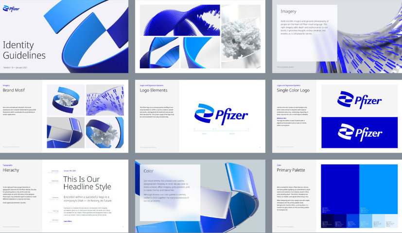
Pfizer’s new visual identity, developed under the motto “Breakthroughs that change patients’ lives”, is also made up by the Noto Sans font reflecting the manufacturer’s patients-and-science duality, according to Team. Originally created by Google for digital internationalization, it offers consistent visuality supporting over 800 languages.


