

Last week, the Ottawa Senators rolled out a new version of the primary logo. Actually, it’s nothing more than a slightly changed iteration of the emblem the team was using from 1997 to 2007. As a Senators press-release says, the revival of the old insignia has happened on numerous requests from the team’s fans, players and partners.
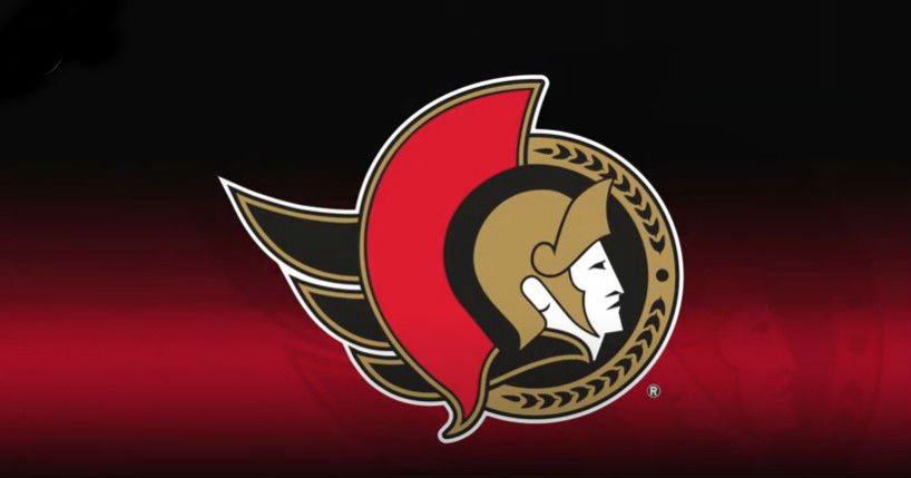
According to Eugene Melnyk, the franchise’s owner, while restoring the side-view depiction of the Roman legatus, the Senators are returning to their roots. This emphasizes that the team has strong heriage, and their goal is to build something new and bold on it and to start a new chapter in their history.
The revived logo still features a couple of small details that distinguish it from the vintage Senators emblem. The legionary now has a gold cape instead of the red one that was in the original version – probably, the change was done to look more harmoniously with the gold semicircle – and the red comb on the helmet has received a bit rounded corners on the top and bottom.
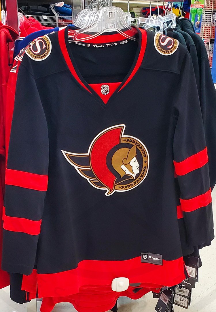
The Senators’ rebranding is not limited to the updated logo. The team management said the emblem will be shown on the new uniform the players are going to demonstrate for the first time at the 2020 NHL Draft on October 6th. In all likelihood, the Senators will wear dark blue jerseys with red stripes on the sleeves and at the waist like that one leaked online this month.


