

Celebrating its 135th anniversary this year, Olympia London, the largest exhibition center in the UK, is currently undergoing a process of redevelopment. Besides rebuilding existing exhibition spaces, the venue is planned to be expanded with a 1,500 seat theater, a music hall, which will be able to accommodate 4,000 spectators, dining, retail, and other public spaces. Such an enormous reconstruction certainly requires a fresh visual identity, and this task was commissioned to SomeOne design studio.
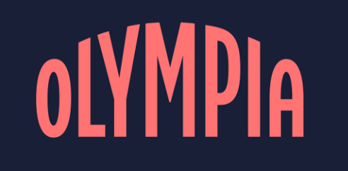
The main idea about Olympia’s new branding was to show that it is the hottest place for hospitality, creativity, and experience in the British capital. For the venue’s logo, the SomeOne team, assisted by Miles Newlyn, took inspiration from the famous arcs of the Olympia Exhibition Halls. Forming an arc with rounded letters, the wordmark is designed in a bold and simple manner, embodying the idea of longevity, according to the studio.
Some brand visual elements are based on “the “O” standing for Olympia”. These assets include things associated with the center, like musical instruments, foods, or furnishings, symbolizing business and entertainment activities in Olympia.

The Olympia branding also includes a custom typeface based on the fonts which were used for the exhibition center’s posters more than 30 years ago. Called Right Grotesk, it was developed by Pangram Pangram Foundry.
Supporting the branding system, the Olympia color palette emphasizes the flexibility of the design, combining dark shades and bright pastel hues. This is perceived as a game of light and shadow, creating the atmosphere of the showtime.


