

Launched in 1989, Telcel is a leading Mexican wireless telecommunications company. Currently, Telcel’s cellular network covers over 73% of the country’s geographical area. Recently, the company updated its visual identity by removing the iconic phone symbol that had been present since its inception and redesigning the wordmark.
![]()
Although Telcel made its appearance in the late 1980s, its roots can be traced back to 1981 when it became Mexico’s first mobile radio service, providing phone connections in cars. Presently, the provider boasts 83 million users and an annual turnover of $12 million. Interestingly, the company has a long history predating the development of mobile technology, having been established in 1926 and undergoing several name changes. It adopted its current name after being acquired by Carlos Slim, who is now recognized as one of the world’s wealthiest individuals.
The design of Telcel’s original logo was quite intricate, featuring a dark blue badge with the brand name in an italic lowercase font. While no official explanation has been provided, the striped pattern within the logo concealed a symbol resembling a cell phone. The wordmark appeared as if emerging from the stripes, with each letter having a unique design.

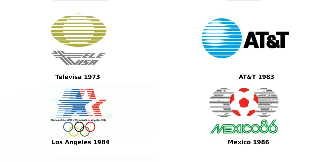
This structure was evidently influenced by the design trend of that era known as Zeitgeist. Similar solutions could be observed in logos like AT&T, created by Saul Bass in 1983, and Televisa, a Mexican entertainment company, whose logo was designed by Pedro Ramirez in the early 1970s. Striped patterns were also incorporated into the logos of the 1984 Olympic Games in Los Angeles and the 1986 FIFA World Cup in Mexico. The latter was developed by Lance Wyman, who collaborated with Ramirez and drew inspiration from Mexican national art.
The 1994 redesign brought significant improvements to the logo, enhancing its readability. The striped pattern was retained only for the icon, which now consists of eight stripes instead of the previous nine. In this iteration, the cell phone icon was made smaller and aligned with the slope of the letters.
Now, let’s delve into Telcel’s new identity. The main change lies in the removal of the phone symbol. The wordmark has been redrawn to present a fresh appearance, featuring adjusted letterforms and a new shade of blue. This rebranding aims to eliminate a recognizable yet outdated icon, which may appear vintage or peculiar to Generation Z. While this is a reasonable move, considering the significance of visual arts in Mexico, the brand should also contemplate adopting a more modern symbol.

Regarding the color palette, Telcel has consistently utilized the color blue in its visual identity throughout its history. This color is commonly associated with technology companies. The previous iterations of the Telcel logo incorporated different shades of blue, whereas the new version showcases a deeper hue.
When Telcel updated its logo three decades ago, it also introduced a serif font with increased letter slope. The current logo design retains this typeface, albeit with some minor imperfections corrected. The company’s corporate font, Telcel Sans, created by typographer Gabriel Martinez in 2011, has also undergone some adjustments. The font family comprises ten variations intended for diverse media and communication contexts.


