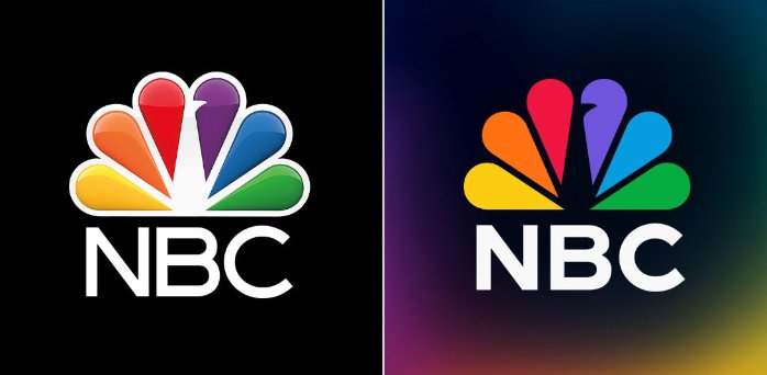
The NBC peacock with its colorful tail is one of the most famous and recognizable logos. First introduced in 1956, it has undergone six iterations. Recently, the network has presented the seventh which is to match the emblem of NBCUniversal’s streaming service Peacock. The design has dropped the glossy effect and color gradients.

The peacock’s current image as we know it today appeared in 1986, designed by the Chermayeff & Geismar studio. That rebranding also brought the NBC lettering executed in a corporate typeface based on the Futura font family. While the new version retains traditional coloring, its distinction lies in a bit different design of the peacock and a new font for the “NBC”.

The previous facelift of the NBC logo was in 2013. The network, like many other companies at that time, aimed to maintain communications via a brand identity with such visual effects as glossiness, shadowing, and pseudodimensionality. However, this trend turned out to be not so steady, and companies are now rethinking their logo messages, reducing their emblems to the basics to express their values and attractiveness.
The new NBC logo showcases the six-segment feathering without additional bordering, against a black background now. The peacock’s head and beak were somewhat enlarged. The typography uses a bolder, geometrical sans-serif font.

Overall, the NBC rebranding means not so much a kind of relaunching as re-organizational processes which mostly go in the background. While the broadcasting network published no official statement yet, its accounts on Facebook, YouTube, and Twitter have adopted the new logo. It was also noticed in several program announcements.


