Three years ago, Chip and Joanna Gaines, who hosted the Fixer Upper series on the DIY Network, announced they would launch a new broadcasting company in cooperation with Discovery. While the DIY’s transformation into a new network had been delayed due to the coronavirus pandemic, the entertainment venture was successfully launched only a couple of days ago.

Named after the previous company of Chip and Joanna they have in Waco, Texas, the Magnolia Network will carry a refreshed programming, focusing on documentary series related to home repair and renovation. The network will broadcast under an original visual brand connected with the Gaines’ agricultural business in Texas.
The visual identity for the Magnolia Network was created by the New York-based design agency Loyalkaspar that has a lot of experience in working with big media companies like MTV, CNN and Paramount. Developing the new brand, the designing team tried to make it a harmonious part of the Magnolia family.

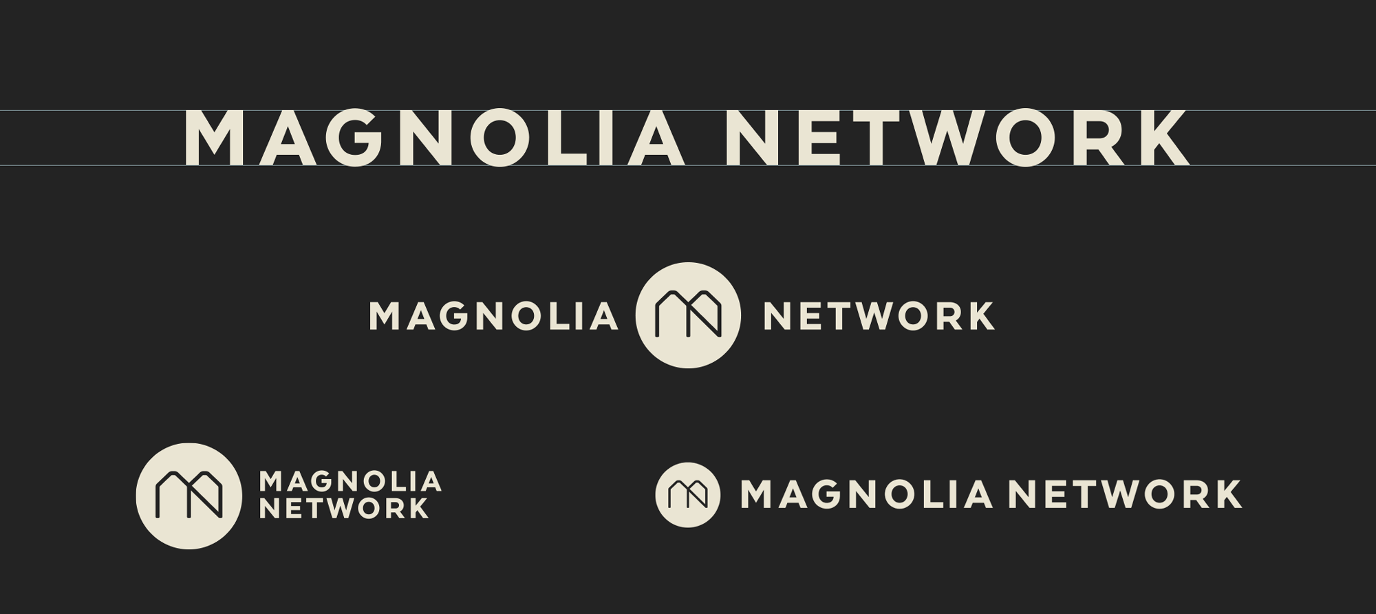
The MN logo represents a monogram named the Silocon as it is inspired by the form of Magnolia’s silos, according to Loyalkaspar. Designated to be a key symbol of the brand, it is complemented with a bespoke wordmark. The identity also includes two custom typefaces – Recoletta and Walsheim. The former, a serif font, is connected with Magnolia’s publishing division, while the latter, with its simple and geometric forms, is to be used on the Magnolia Network.


