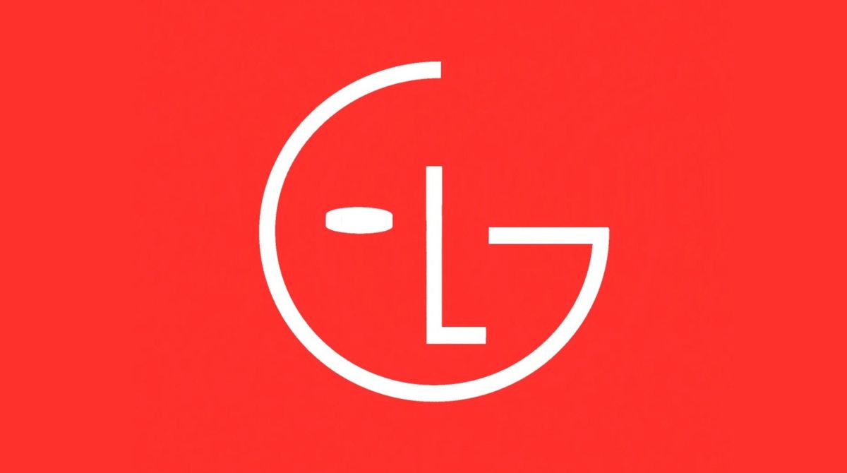
The face/smile design is quite popular in branding. Amazon, Colgate, and Danone are just a few examples of using such elements. More rarely you find a face logo that would change its expression like the new LG logo in a fresh brand identity the company has presented a few days ago. Developed for digital promotion, the animated design can show off eight different facial expressions.

Elevating the South Korean company to a next level, the new visual identity of LG Electronics is designed to be suited for both physical and digital carriers. According to a press release, the rebranding’s goal is to put LG closer to the new generation and confirm it as an iconic brand. The company also aims “to rethink its visual strategy to tell its values to all customers regardless of their location on the planet”.

The most surprising thing in the visual identity is the animated version of the LG logo for digital media. This branding feature is to give the brand more expressiveness and dynamism, as the company says. The symbol made up of an “L” and a “G” can do different actions, like nodding, winking, or turning. “This incarnation of the logo will meet customers with a smile or move to the rhythm of the music on digital platforms”, LG explains.
In addition to LG’s classic red (closer to purple), the company will also use a color named LG Active Red, a brighter tone to “offer a special variety accordingly to the features of every product”. Also, the brand’s slogan “Life’s good” will appear more frequently on the packaging, designed in a new font.
If we compare the new logo to the previous one, it may seem that the changes are minimal. Formally speaking, the smiles are identical. However, even the subtle changes make the LG face more vivid, with a more serene appearance, as if it expresses kindness, happiness and, of course, curiosity for the user.


