

One of the leading TV networks in the UK, ITV has partly changed its visual identity, following its parent company ITN which we recently reported. The rebranding was carried out as a part of the network’s revised strategy that focuses on the new streaming service ITV X now.
ITV was launched in 1955, with the idea to break the monopoly of BBC at that time. Over four decades after that, the network had been operating separate TV companies which shared common programs and series, having, however, each its franchise. Now, after several mergers and acquisitions, these fifteen regional franchises are owned by two networks: STV which broadcasts in Scotland, and ITV for the rest of the UK.
The journey of the network has been full of TV hits, like The Saint, Mr. Bean, and Downton Abbey. ITV has also been airing such popular shows as Got Talent, Who Wants To Be A Millionaire?, and The Alphabet Game which have been versioned and adapted in many countries.

To refresh ITV’s look, the network’s creative department was cooperating with the DixonBaxi studio, creating a modern identity which is to reflect the essentials of ITV and connect it to its audience. According to the designers, the project was inspired by contemporary British culture.
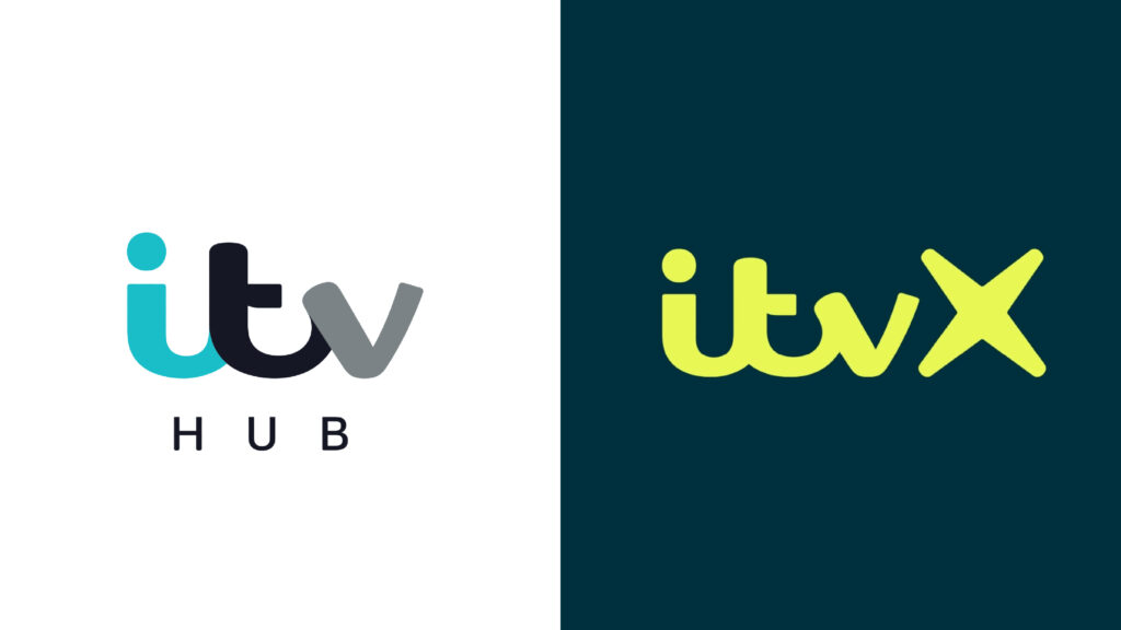
One of the most remarkable renovations of this project is the change of the name of the network’s streaming platform – ITV Hub was renamed to ITV X. There is a whole strategy behind this as the service is going to be the center for the entire group, and the other services and channels will revolve around it.
As the network’s representatives say, ITV X was built from scratch as a multiplatform entertainment direction aiming, in all its aspects, to rebel against the rules of the broadcasting landscape. The X is the heart of the brand, creating equity in the logo with every application.
The new identity was designed to make the brand stand out from competitors and draw attention, reformulating what ITV is as a whole. The two major goals of the project were to change the public image of the network and to build a cliché-breaking streaming service.
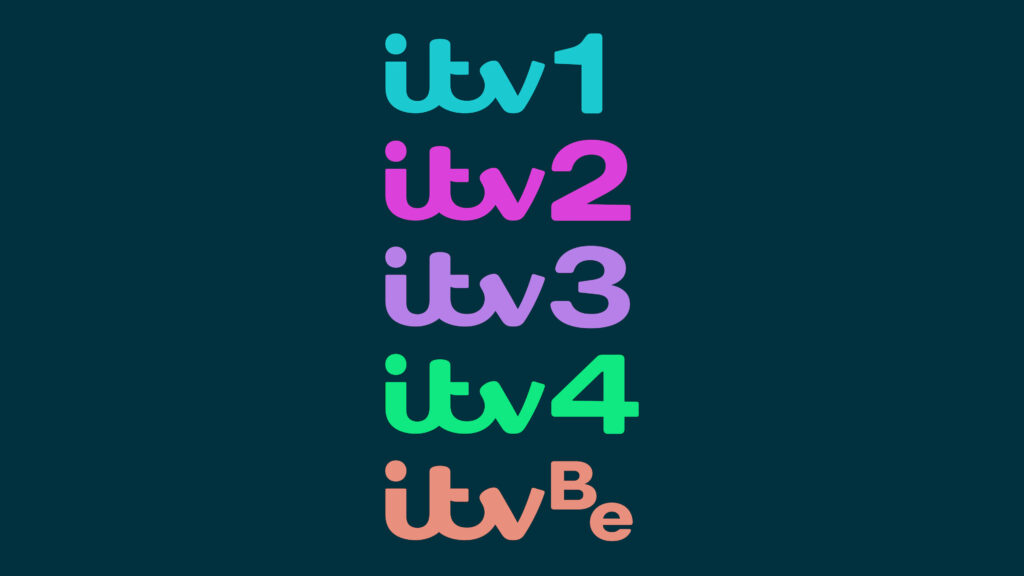
While the new identity is executed in an all-encompassing design system, the color palette is based on dark green making contrasting with the lime green that is to place accents and express the energy the new brand needs.

As for typography, two new fonts were developed. The ITV Display Serif typeface was inspired by historical British fonts like those of the William Caslon Foundry, while the ITV Display Sans is modern and clear, featuring sleek lines.
Focusing on the platform is an interesting and logical move in terms of content providing, and this is a determined bet that may cause some risks if it isn’t made at the right time. For instance, Warner Bros launched HBO Max some time ago, but a lack of investments and content and subscription issues led the company to considerable reductions in the budget, employees, and projects. In the case of ITV, however, the profile looks healthier, and the network has enough strengths to take certain risks, investing almost all its means into ITV X.


