

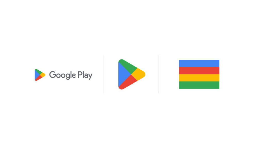
Google Play has updated its logo to be more consistent with Google’s general visual style. The redesign is timed to coincide with the 10th anniversary of the official Android app store.
Since Google Play’s inception in 2012, the logo of the digital distribution service has hardly been changed. Being quite expected, this logo update, following the renovation of Google Chrome, means the continuation of the IT giant’s aspiration to unify its products in terms of brand identity.
![]()
While the Play symbol still consists of four sections in different colors, it has been somewhat altered. First of all, its corners are rounded now, making the emblem softer. The four parts have been redrawn and adjusted as well, having less space for blue which was dominating in the previous version. Thus, the other sections have received more space, while the general design is more proportional. The logo looks flat as the subtle gradient was removed.
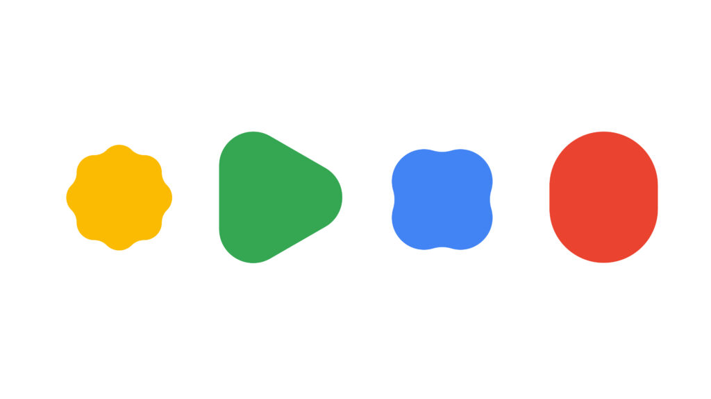
The logo redesign comes with other brand elements featuring the same rounded corners and colors as the main emblem. This solution makes the Google Play identity closer to the design language of Google which is called Material You and applied to different products of the company.
At the same time, Google Play’s redesigned logo has raised the issue of the monotony of the Google logos again. Although the four-color design aesthetically works, you may have some problems, while using the apps day after day. The similarity of the Google emblems can be confusing, making you mistakingly launch a wrong application.
While analyzing the visual transformations of the Google products we saw lately, some design experts believe that the branding policy the company has pursued since 2014 needs to be corrected. The company has got stuck, with no further ideas. However, it has to realize that the brand is not only a good-looking symbol, and if you have an ecosystem, you have to give every part of it its own role and a distinct face.


