

Founded in 2008 by software engineer David Barrett, Expensify is an online platform providing expense management tools for companies of different scales and orientations. Expenditure control can be managed through one app, including such financial accounting means as expense tracking, corporate cards, invoicing, and others. Headquartered in San Francisco, the software company also operates several offices in the United States, the UK, and Australia. Celebrating its 15th anniversary, Expensify has recently unveiled its new visual identity, which was created by a joint unit of its in-house design team and The Collected Works, a studio from New York.
![]()
Realizing that the company needs something more modern to attract customers, the design team built a unique brand system that would properly convey the world of Expensify. In this connection, the ability to create the best solutions while expressing its unique face has been defined as the main quality of the company to serve as the starting point of the rebranding. Beginning with identifying the major problems with the old identity, the brand found that there was some insufficiency and inconsistency in the typography and color palette it was using.
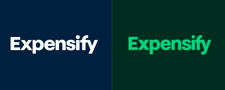
At first sight, the Expensify logo doesn’t seem to have changed much. Indeed, you should have a closer look at the wordmark to spot the difference. The slightly altered letterforms actually witness a serious approach, making this element a bit softer. While the narrowing of the “p”, “n”, and “t” is barely noticeable, the curl in the “y” is more visible.
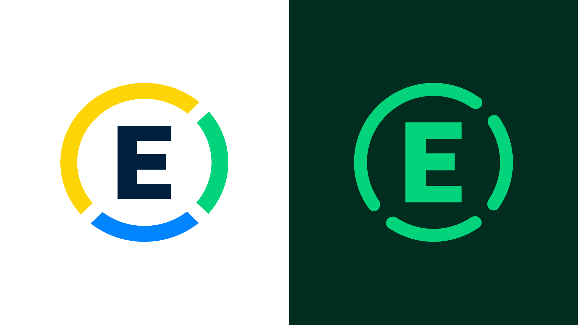
More significant changes can be seen in the E monogram. The icon switched from the colorful design in the gapped circle to a monochrome coloring to match the general structure of the logo, while the circle’s upper and left parts merged into one, and the strokes themselves received rounder ends. This design has a softening effect as well.
The wordmark gave inspiration to new typography, which is not so uncommon in redesign projects. Being a cornerstone of the new Expensify design language, the typographic aspect deals with three custom fonts, Expensify New Kansas, Expensify Mono, and Expensify Neue, which give the brand a utilitarian and playful vibe.
When it comes to the color palette on its own, the dark tones were a deliberate choice of the company. Designating dark green as the main brand color, Expesify expanded the gamma with various shades of green as well as other colors that, according to the brand, would create a more cheerful range of hues.

The richness of Expensify’s colors is brightly demonstrated in a series of icons, vignettes, and illustrations created in collaboration with Brooklyn, NY-based Augenblick Studios. This illustration universe includes here and there quirky and weird forms and characters, which are somewhat reminiscent of those of the iconic Yellow Submarine animated film. Such playful aesthetics work well across the brand’s digital and physical assets.
Overall, the presented identity is a really great work combining standard and unconventional methods of graphic design. In this branding, plenty of forms and colors make such a seemingly boring thing as expense management truly fun and cool.


