

![]() Foursquare Logo PNG
Foursquare Logo PNG
Foursquare is the name of the application, which gives recommendations on hospitality and leisure spots, based on the user’s location and browsing history. The service was developed in 2009 in the USA and today is available in 12 languages.
Meaning and history
![]()
2009 – 2014
![]()
The original logo showcased the name of the brand in a slightly italicized sans with only lowercase characters. The type was soft, with slightly extended and rounded ends of the letters.
The white and light green letters had deep dark blue shades around them, which slightly damaged the legibility.
The current version appears better legible and, of course, more meaningful due to the flag.
2014 – 2020
![]()
The Foursquare visual identity, designed by the Red Antler bureau in 2014, is modern and stylish. The shapes and color palette of the logo create a trendy and confident sense.
The Foursquare logo is composed of a wordmark with an emblem, which is used on its own for the brand’s website and mobile app.
The app’s name inscription in all capital letters is executed in a bold and solid sans-serif typeface, with traditional letterforms and diagonal edges of the “E”s horizontal bars.
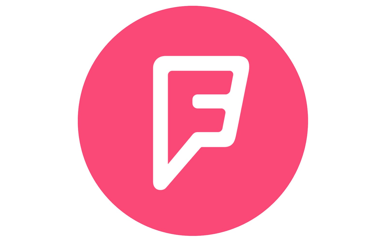
The Foursquare emblem is a stylized map pin, which has a letter “F” inside. Its pointed tail and sleek lines resemble a superhero symbol, which is dynamic and powerful.
The blue pink and white color combination of the Foursquare logo evokes a sense of creativity and youthfulness. It looks bright and dynamic, representing a growing and developing company, which is focused on a young audience.
2020 – today
![]()
In 2020, they revamped much of their colorful imagery in favor of strict, black branding. The logo is particular is now the name of the company, written in black, thin letters. The font is a sans-serif with all capital letters. It’s a rather basic font with typical forms and adequate proportions – very strict and proper, compared to the previous designs.
Font
The font they used since 2014 is a straightforward sans-serif style. In the wordmark, they are fully capitalized, as well as bold. It creates an imposing sight that efficiently draws attention. The font itself uses regular letter templates with several small modifications. Some tips are cut at a small angle, including horizontal ones in ‘F’, ‘E’ and ‘Q’. The tail at ‘Q’ also widens near the end.
Color
The main color palette has long been navy blue with dark pink. They also use white to a degree, primarily for borders and such. The dark blue tones have been the dominant shades ever since the adoption of the 2014 logo. Latterly, however, they started switching rather for black.


