

Fifty years ago, Pink Floyd released their Dark Side of the Moon, a studio album that influenced much the world of rock music. Many believe it’s one of the best albums ever recorded. To celebrate the anniversary, the rock band is planning to launch a re-edition of the iconic album, presenting first a cover for the future record.
Long-time fans of Pink Floyd surely know that the original Dark Side of the Moon of 1973 featured a cover depicting a triangular prism dispersing a white light beam into the colors of the rainbow. Designed by Hipnognosis, a design group that worked with many musicians and bands at that time, that gatefold became as classic as the album itself. But apparently, the new generation of fans is unaware of this fact as the cover logo for the re-edition caused a backlash when presented.

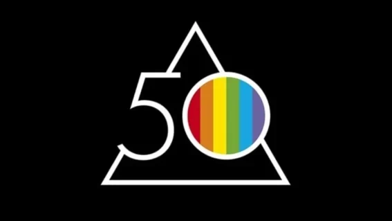
Alluding to the 1973 edition, the anniversary logo combines a triangle, the number 50, and rainbow stripes placed into the 0. In general, the design is in accordance with the modern rules of simplicity with few clear white lines against a black background. As for the rainbow motif, it turns out to be a symbol of different things these days than it was half a century ago.
Criticizing the logo, some people argue that the British rockers refer to the flag of LGBTQ+, aiming to be “woke”. It’s hard to believe that Pink Floyd fans could forget the rainbow from the iconic gatefold. Nevertheless, the comments on the web are full of complaints about the alleged aspiration of the band to meet the agenda. Fortunately, there were also other people who reminded of the origins of Pink Floyd’s rainbow.

Expected to be available to pre-order from March 24th, 2023, the re-edition of the Dark Side of the Moon will represent a box set including a CD and a vinyl record. It will also feature the first standalone LP release of Live at Wembley Empire Pool, London, 1974.


