

Established in 2009, OVO Energy is a British company involved in energy trading. Over the first decade of its existence, the enterprise had demonstrated steadfast growth with some business acquisitions, especially compared to other smaller energy companies in the UK. However, the economic and political turbulences of the past few years have had a rather negative impact on the business. So, hoping to straighten things out, OVO Energy has carried out a rebranding, assisted by Wolff Olins.
![]()
Creating a new look for OVO, the design studio tried to highlight the company’s relationships with its customers. In the original branding, it is expressed with the so-called hero square which symbolizes “a window into customers’ life”.
Another idea proposed by Wolff Olins was to show that OVO’s efforts to discover better ways to supply energy, helping consumers make thrifty use of natural assets which is quite an important thing in today’s situation with climate change. This responsible attitude towards the environment should envisage a more active development of smart technology and innovative energy-saving, as the studio’s creative director Stewart Davis says.
![]()
Considering these customer and environment-oriented ideas, OVO’s new visual identity basically conveys “putting people at the heart of energy”, according to Wolff Olins. Behind the branding, there is also the company’s ambition to become the leader in the “corporate” energy segment. As Davis admits, much of the brand image of OVO Energy was laid down by NB Studio, a long-term partner of the company, that created the core of the identity including the OVO square for the brand’s logo as well as a corporate typeface.
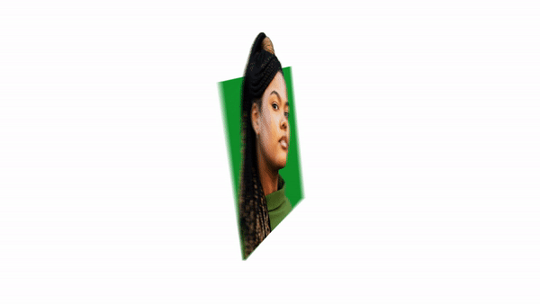
Wolff Olins rethought the brand’s symbol as a link with customers, which also represents a wide range of OVO’s offerings. In the visuals, the square is used as a frame for photographs, reinforced by the parallax effect in dimensional versions.
Davis says the most challenging thing of the project was to save the OVO square as a visual DNA of the brand. The logo also served as a reference point for the rest of the branding which comes unfolded into a whole design system including a set of icons, images, and spatial design. For some elements to be perceived as deep and palpable, the design team used a double-layered negative space modeled on the logo’s pattern.

For OVO’s visual identity, Wolff Olins bet on dimensionality and motion that would create a feeling of something powered by natural energy. Based on this idea, the square is animated in three kinds of motion: spinning, swiping, and scaling. They are used to reveal information on the company’s products and services, also providing guidance through the OVO platforms.


