

The Bangko Senrtal ng Pilipinas (Central Bank of the Philippines) has unveiled a new logo, replacing the old emblem introduced ten years ago. The management of BSP said the “brand refresh” is intended to make the institution more relevant to the people of the Philippines.

BSP’s new seal represents a roundel featuring a golden eagle with spread wings, three stars above it and the inscription “Bangko Sentral ng Pilipinas” below. The eagle and stars — which are also depicted on the Philippines’ flag and coat of arms, and symbolize the three major island groups of the archipelago – are the traditional symbols for the BSP logo. The new iteration’s eagle looks more realistic compared to the previous one that was carried out just with separate white strokes. In addition, the background blue color has grown darker, making a higher contrast with the eagle.
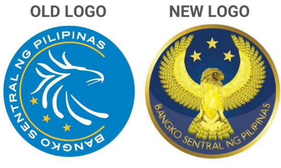
According to Benjamin Dionoko, the president of BSP, the updated logotype brings refreshed vitality, while emphasizing the wholeness and abilities of the institution, and corresponding to the new financial policy program planned for the next three years.
However, the new logo with its realistic design was not to everybody’s liking, when rolled out on social media. Some people said that the previous BSP emblem looked more contemporary and appropriate for printable and digital materials, while the renovated seal was described as a step backwards, fitting more for a fascist state than a modern financial organization.


