

Established in 1997, the Chicago Fire can boast its glorious history and traditions. The club had a great beginning in the Major League Soccer in 1998, when it won the MLS Cup and then made a “double” by winning the US Open Cup – later, the Fire won it for three times more. Now, after 21 years in MLS, the soccer club is changing its identity including a new name and logo.
Since now, the Fire’s official name is Chicago Fire FC, where the “FC” (football club), that has replaced the “SC” (soccer club) is a homage to the global game while reflecting a long-dated vision of it.
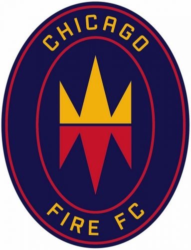
As for the Fire’s new logotype, it is the first renovation of the team’s symbol since its founding. The badge of an oval form, which is unique for MLS, features “CHICAGO” on top, “FIRE FC” on the bottom and two simmetrical figures in the middle. The upper yellow figure looks like a crown, while its red copy mirrored downwards can be seen as a flame referring the club’s name.
According to the club’s owner Joe Mansueto, the new identity of the Fire is itented to convey the force of Chicago that helped to rebuild the city after the Great Fire of 1871 after which the club was named as it was founded on 126th anniversary of that disaster.
Although the Fire’s officials are expressing their excitement about the team’s new emblem, the renovation has met mostly negative reactions from the club’s fans who desribed it as “the worst badge in the history of football” and joked that “the designers should be fired”. Some experts say that, facing such a disapproval, the Fire may restore its previous St. Florian Cross logo.


