

Established in 1927, Cats Protection (formerly Cats Protection League) is one of the oldest animal care organizations in the United Kingdom. The charity’s mission includes rescuing and finding homes for homeless cats, supporting the neutering of cats, and raising awareness of cats and ways to take care of them. By updating its visual identity, which was fulfilled by the London-based design studio Lukecharles, Cats Protection hopes to tell about its values in a more clearer way, armed with a new and ambitious strategy.
![]()
The charity’s old logo featured a depiction of a cat in the manner of a child’s drawing. Although it seemed to feel warm, this brand, according to Lukecharles, was holding Cat Protection back, lacking recognizability. So the studio developed a new design system that has to be a bright presentation of the organization’s services and a proper means to reach new audiences.
![]()
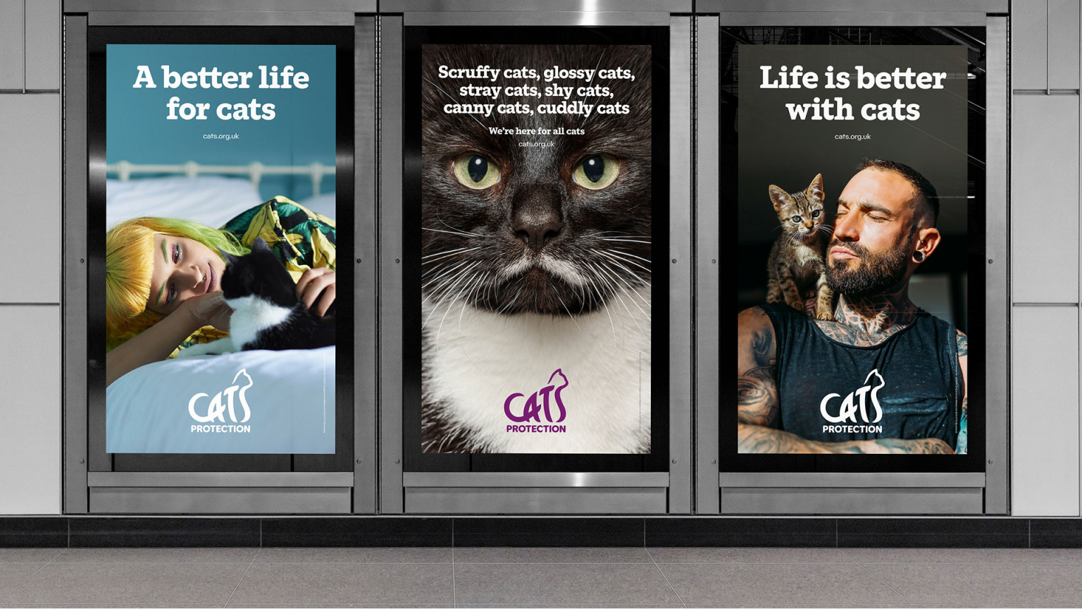
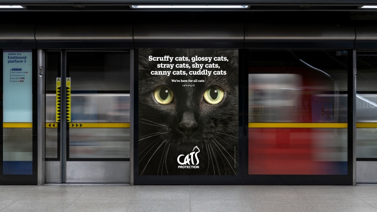
The rebranding project was carried out under the motto “Making a better life for cats, because life is better with cats”. According to Rebecca Walton, the studio’s brand strategy director, the goal was to create “a longer supporting narrative” with an additional system of graphic objects that would be used for a communicative purpose.
Refreshing the brand, the design team drew a new cat with a sleek outline partly formed by the word “Cats” as a part of the charity’s name, which is drawn with wide and a bit curved strokes. “Protection” is placed below, designed in a simple, sans-serif typeface. As Lukecharles creative director Luke Gifford says, the studio took inspiration from the elegant dynamism of the feline form. This design, where the wordmark is incorporated into the cat’s outline, reflects the activity of the charity that unites people who care for cats.
Cats Projection’s corporate typography is represented by a custom serif typeface designed by the NaN foundry. Embodying a mix of warmth and expertise, the font symbolically conveys the established image of the charity as a “caring brand”, while its new strategy has given an idea to add some “authority vibe”. As Lukecharles admits, the typeface’s rounded letterforms were inspired by feline sleekness as well.
As for the color gamma, the brand’s previous blue and yellow were rejected as unsuitable for the modern animal care segment. Instead, Cats Protection will appear under the purple color, which is to symbolize “the sophistication of cats” and the organization’s basic values.
Besides this, the color palette, which was intentionally limited, as the studio says, includes several shades of purple. While Cats Protection previously used a variety of colors to communicate with people, a more consistent color scheme should make the brand more recognizable, associating it with a certain design.


