Established in 1885, Boehringer Ingelheim is a German pharmaceutical brand that ranks among the top 20 companies in the global industry. This family-run business, headquartered in Ingelheim am Rhein, Germany, currently operates 142 offices worldwide and employs over 47,000 professionals. With the aim of enhancing its recognition and strengthening the connection with its target audiences, the brand has recently unveiled an updated identity.

The redesign process was carried out in collaboration with the design studio Interbrand (Cologne/Berlin), while the international branding agency BBDO is responsible for executing a comprehensive relaunch campaign that will continue until April 2024.
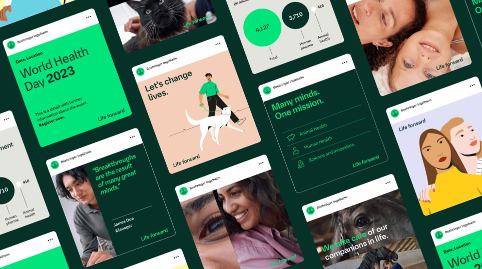
For the first time in 26 years, Boehringer’s visual identity has undergone significant changes. The company believes that a solid foundation is necessary for effective communication with the world. The new brand look is characterized by a fresh color palette, a custom typeface, and a newly introduced slogan, “Life Forward,” which reflects a sense of unwavering optimism. According to Mérard Schoenmackers, the company’s corporate communication director, Boehringer Ingelheim approaches everything it does with confidence in the future, as it possesses the ability to shape and influence it.

Over the decades, Boehringer’s visual identity has been predominantly blue. However, with the recent redesign, the brand has made a shift to Dark Green and Accent Green (a lighter shade) as its primary colors. These new design elements have already been implemented on the company’s website and mobile app.
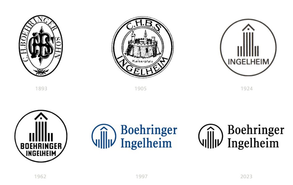
Since its establishment, Boehringer Ingelheim has undergone five logo changes. In 1924, the company adopted an emblem that differed significantly from its two previous versions. Reflecting the trends and tastes of that era, the Ingelheim Imperial Palace (Charlemagne), the brand’s symbol, was simplified and transformed into a symbolic representation of the Heidesheimer Tor, the main gate of the palace, enclosed within a circle.

The most recent logo change occurred in 1997, where the central figure was merged with the circle at the bottom. Additionally, the wordmark was removed from the circle and placed on the right side. This structure, developed by MetaDesign, has been retained in the current redesign.
As part of the rebranding process, the company has also introduced its own custom typeface called Boehringer Forward, replacing the previous BI Sans font designed by Ole Schäfer.

While there have been minor adjustments in the visual identity, apart from typography, the rebranding has its own rationale. Even a well-designed logo can benefit from slight modifications to align with modern design influences. The decision to maintain the logo’s original form is likely connected to the character of Boehringer Ingelheim as a family business, where tradition holds significant value. Therefore, the preservation of the logo’s form serves as a clear statement that, despite the changes, it remains a symbol of continuity.


