

Until recently, the Kingdom of Bhutan was one of the most closed countries in the world. Opening itself to visitors, it has changed its image. Although Bhutan restricted tourist visits during the Covid-19 times, the country is now inviting guests again, with an updated national brand and a new tourism strategy.
A few days ago, Bhutan introduced a new national branding that has to demonstrate the development of the country and the spirit of optimism, internally and externally, according to Bhutan’s Department of Tourism. The country’s refreshed visual identity is intended to awaken the pride of citizens and the imagination of visitors.
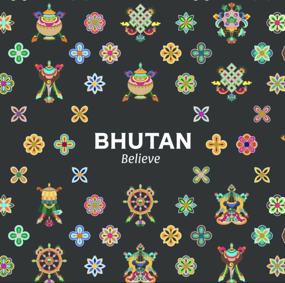
The new brand’s concept “Bhutan Believe” will first be implemented in the tourism industry. Later, it will be adopted by other governmental institutions. This concept is also planned to be applied to the design of official websites, stamps as well as celebrations on national holidays.
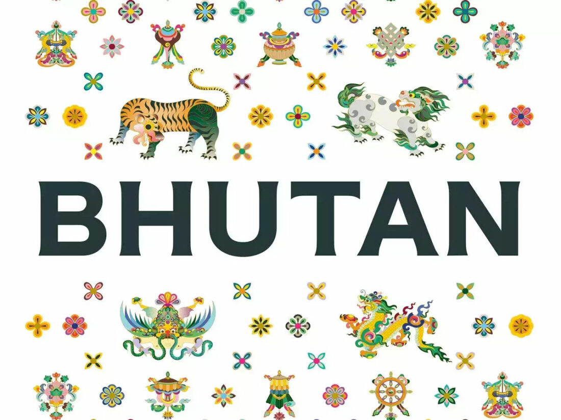
One of the important parts of the national brand is Bhutan’s new graphic identity which is a modern interpretation of the heritage of the country, tourism officials say. In terms of coloring, it is based on the yellow-and-red flag of Bhutan, supplemented by a color palette which is inspired by the local nature — Ceder Green refers to the forests covering 70% of the country’s territory, Blue stands for the meconopsis, or the blue poppy of the Himalayas, Bhutan’s national flower, and Delicate Black symbolizes the ash from the bonfires which are being lit by Bhutanese shepherds across the country.
With these colors, a new system of a graphical identity was created, based on the traditional Bhutanese iconography dealing with mythical animals, religious symbols, and other folklore elements.
The new tourism policy of Bhutan is seen as a part of the nation’s transformation that includes educational and financial reforms as well as changes in civil services. These innovations aim to open new opportunities for contemporary people and future generations.
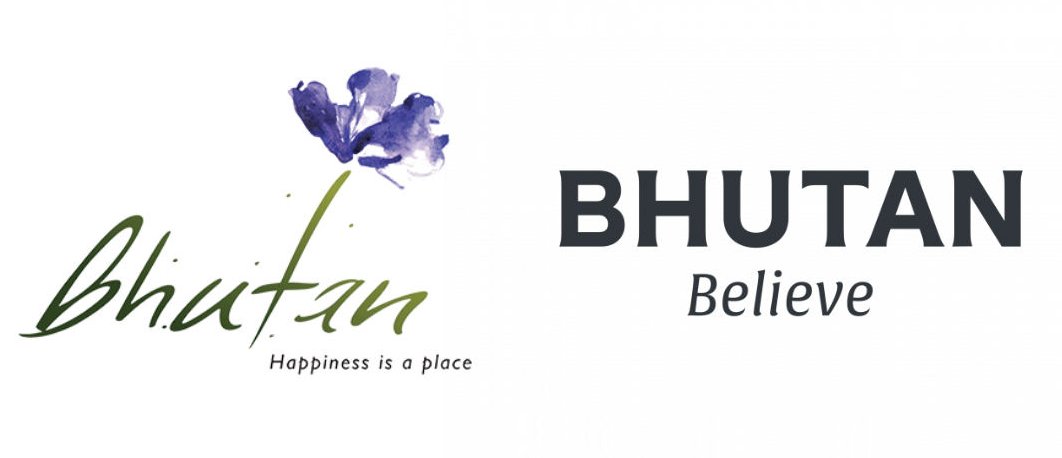
Bhutan first introduced a tourism brand 11 years ago. The visual identity then featured the blue poppy. Now, the country says goodbye to the flower aesthetics, adopting a pure wordmark. Its logo is modern and clear, conveying a brave and self-confident country, and thus, reflecting the future-oriented spirit of the nation. The emblem was optimized to be used in different sizes and environments.


