

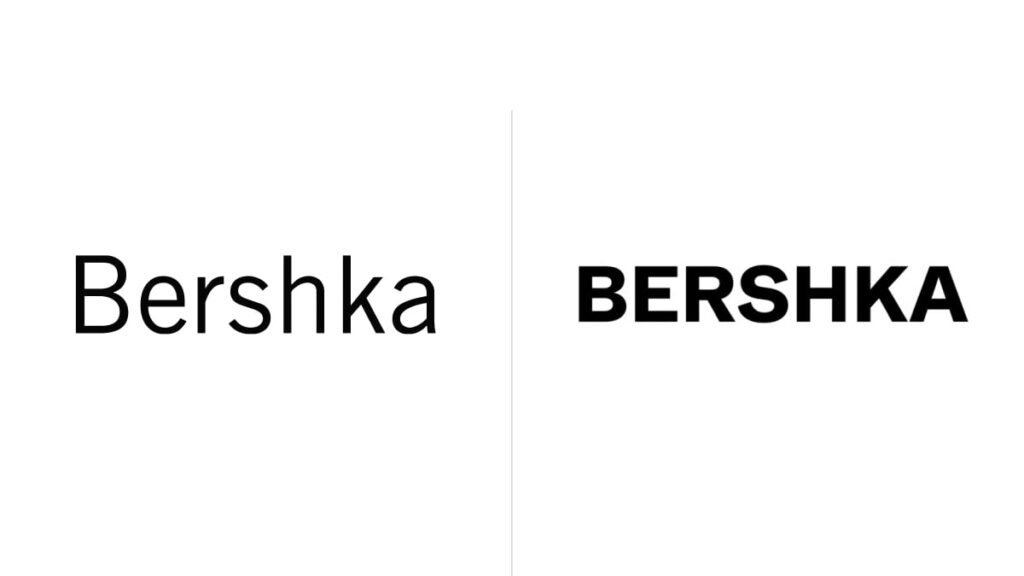
Launched in 1998, Bershka is a Spanish-French clothing retailer that is owned by Inditex, alongside such famous brands as Zara, Pull&Bear, Stradivarius, and Oysho. Celebrating its 25th anniversary, the company has updated its logo for the first time in its history.
Bershka announced its fresh branding just a few days after a new design of Pull&Bear was unveiled, featuring a solid all-caps wordmark in black, similar to that of its sibling brand.
![]()
If somebody expected it to be a kind of a wow factor, forget it. The new Bershka logo’s design still resembles those of the related brands. The wordmark is bolder now, showcasing more geometric and integrated typography.
The redesign was carried out by Bershka’s in-house design team in cooperation with a Berlin-based studio that specializes in typography branding and works with the Dinamo Typefaces agency which has some experience in fashion branding.
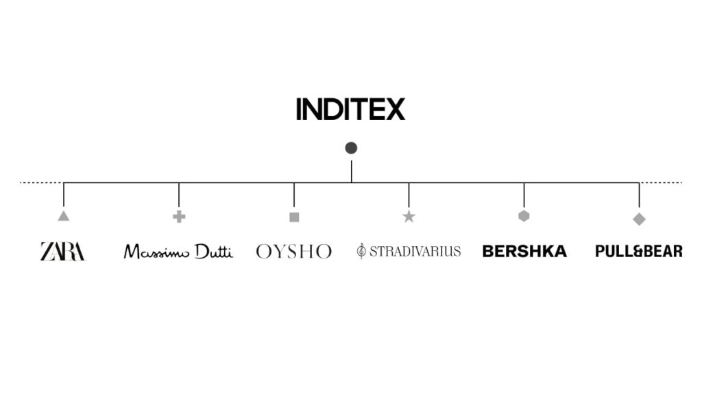
The graphic line of the project reminds us of the latest changes in the look of Inditex, Bershka’s parent body, which underwent a redesign last year. And if we take a look at the Inditex brand architecture, the company’s sub-brands are esthetically aligned accordingly to a general concept, while being, at the same time, sufficiently independent from each other.
On social media, Bershka has already started using a big “B” as a laconic sign of the brand. Another new thing is that the company is restoring its iconic BSK logo as an emblem for its teen collection.
Thus, Bershka’s new visual identity has complemented the changes in the Inditex brands that have occurred in recent years. The group’s flagship Zara refreshed its look in 2019, which was the second logo update in 44 years.
Last year, it was the turn of Stradivarius that remade its logo with new all-caps lettering, saving, however, its customary symbol – the treble clef. Finally, Pull&Bear changed its visual identity last month, rolling out the fourth logo since its inception in 1991.


